Color harmonies transform ordinary rooms into captivating spaces that instantly affect our mood, behavior, and well-being. Think of them as nature’s secret recipe for visual satisfaction – just as a sunset combines oranges and purples perfectly, or autumn leaves blend reds and golds in perfect balance. These time-tested color combinations create spaces that feel intentional and professionally designed, even for decorating newcomers.
Whether you’re refreshing your living room or planning a complete home makeover, understanding color harmonies gives you the power to create spaces that both energize and soothe. From the classic complementary pairs that make elements pop to the subtle sophistication of analogous schemes, these fundamental relationships between colors provide a foolproof framework for confident design decisions.
Your home tells your unique story, and color harmonies are the language that helps you tell it beautifully. Let’s explore how these powerful color relationships can transform your space from simply functional to genuinely extraordinary, one room at a time.
The Science Behind Color Harmony
The Color Wheel: Your Design Best Friend
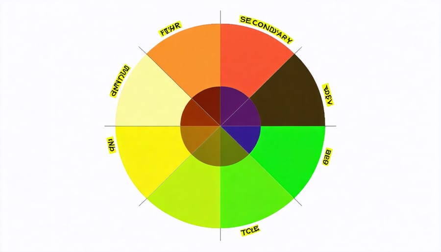
Think of the color wheel as your trusty sidekick in the design world – it’s like having a map that guides you to perfect color combinations every time. This circular diagram isn’t just a pretty rainbow; it’s a powerful tool that helps you understand how colors relate to each other and work together harmoniously. When you’re planning your home’s color scheme, understanding basic color wheel principles can make all the difference between a room that feels “off” and one that flows beautifully.
The wheel consists of primary colors (red, blue, and yellow), secondary colors (created by mixing primaries), and tertiary colors (mixtures of primary and secondary colors). What makes it truly magical is how it reveals natural color relationships – helping you spot complementary pairs, identify harmonious groups, and create balanced combinations that feel just right. Whether you’re painting an accent wall or coordinating furniture and décor, the color wheel helps you make choices with confidence, turning your design instincts into intentional, beautiful results.
Classic Color Harmonies in Interior Design
Monochromatic: Elegant Simplicity
Imagine the calming effect of different shades of blue flowing through your space – that’s the magic of monochromatic color harmony. This elegant approach uses various tints, tones, and shades of a single color to create a sophisticated and cohesive look that’s both striking and serene.
To master monochromatic design, start with your base color, then mix in lighter and darker versions of the same hue. For example, in a bedroom, you might pair soft sky blue walls with navy curtains and powder blue bedding. Add depth by incorporating different textures – think velvet pillows, woven throws, and glossy ceramic accessories all in your chosen color family.
The key to preventing monotony is varying the intensity and brightness levels. Try the 60-30-10 rule: use your main shade for 60% of the space (walls), a lighter version for 30% (furniture), and the boldest shade for 10% (accessories). Don’t forget that white, black, and gray can act as neutral anchors within your monochromatic scheme.
This harmony works particularly well in smaller spaces, as it creates a seamless flow that makes rooms appear larger and more unified.
Complementary: Bold and Balanced
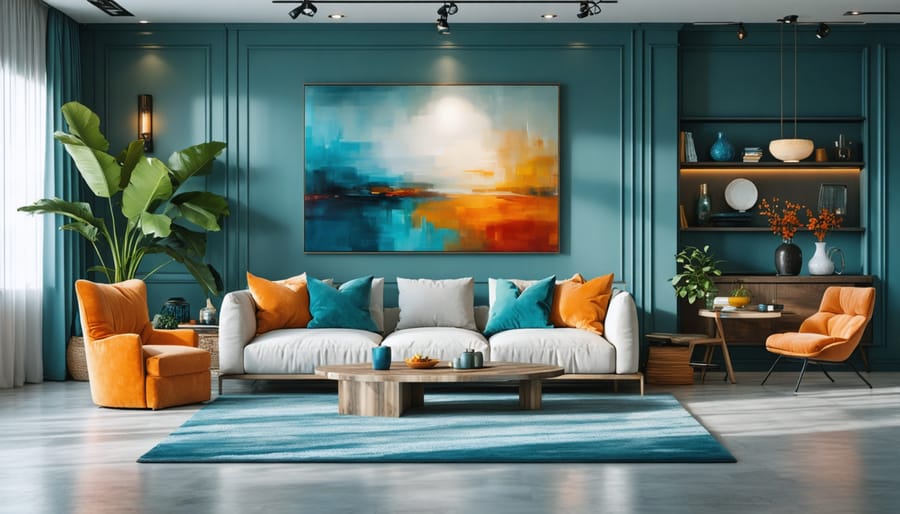
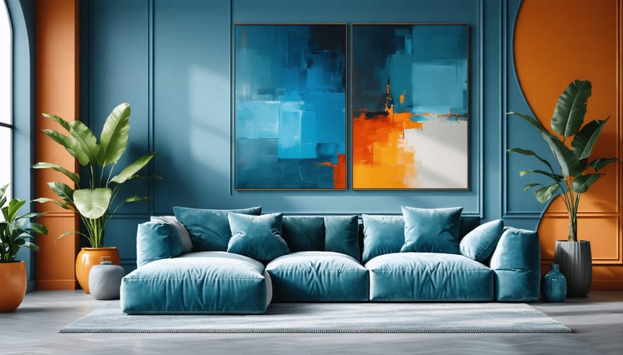
Complementary colors sit directly opposite each other on the color wheel, creating bold and dynamic combinations that pack a visual punch. Think blue and orange, purple and yellow, or red and green – these pairings create instant drama and energy in any room. The magic of complementary colors lies in their ability to make each other appear more vibrant when used together.
When working with complementary colors in your home, balance is key. Too much intensity can overwhelm a space, so consider using one color as your dominant shade and its complement as an accent. For example, in a living room, you might paint the walls a soft blue and add orange throw pillows, artwork, or decorative items for pops of contrast.
A clever trick is to use different tints and shades of complementary colors. Instead of pure blue and orange, try a pale sky blue with burnt orange accents. This approach maintains the striking contrast while creating a more sophisticated, livable space. For beginners, start small with complementary accessories before committing to larger elements like wall colors or furniture pieces.
Analogous: Subtle and Sophisticated
Think of analogous color schemes as nature’s favorite palette – like the gentle transition from yellow to orange to red in a sunset. In interior design, this harmony uses colors that sit next to each other on the color wheel, creating a sophisticated and naturally pleasing look that’s almost impossible to get wrong.
For example, you might combine soft sage green with blue-green and yellow-green for a serene bedroom setting, or warm burgundy with red and red-orange to create a cozy dining room. The beauty of analogous colors lies in their subtle variations – they’re different enough to create interest but similar enough to flow seamlessly together.
To use analogous colors effectively in your space, choose one color as your dominant shade (about 60% of the room), use a second color as support (30%), and add the third as an accent (10%). This creates depth without overwhelming the eye. For best results, make sure at least one of your chosen colors is a pure hue, while the others can be tints or shades of their neighboring colors.
Pro tip: Include plenty of neutral elements to give the eye places to rest and prevent the scheme from feeling too intense.
Triadic: Dynamic and Energetic
Want to add some excitement to your space? Triadic color harmonies might be just what you need! This dynamic scheme uses three colors evenly spaced around the color wheel, creating a bold and energetic three-color balance that can transform any room.
Think red, yellow, and blue – the classic triadic combination that children often gravitate toward. Or try something more sophisticated like violet, orange, and green. The key is maintaining equal distance between your chosen colors on the wheel, which naturally creates visual harmony despite their striking contrast.
To use triadic colors effectively in your home, choose one color as your dominant shade and use the other two as accents. For example, you might paint your walls a soft violet, add orange throw pillows, and incorporate green plants or artwork. This approach prevents the space from feeling overwhelming while still maintaining that energetic vibe that makes triadic schemes so special.
Remember to adjust the saturation and brightness of your chosen colors to create a more livable space. Muted or pastel versions of triadic colors can be just as effective while being easier on the eyes.
Applying Color Harmonies in Different Rooms
Living Room Color Combinations
Your living room sets the tone for your entire home, so choosing the right color combinations is crucial. A popular and foolproof approach is the 60-30-10 rule: use your main color for 60% of the space (walls and large furniture), a secondary color for 30% (accent furniture and textiles), and an accent color for 10% (decorative pieces).
For a calm, sophisticated look, try a monochromatic scheme using different shades of blue, from navy walls to powder blue throws and silver-blue accessories. If you prefer more energy, consider a complementary combination like sage green walls with coral accents, balanced by neutral furniture.
For those who love classic elegance, an analogous color scheme using warm earth tones works beautifully – think cream walls, chocolate brown furniture, and burnt orange accents. To create depth without overwhelming the space, incorporate different textures within your chosen palette.
Remember that natural light affects how colors appear throughout the day, so test your combinations in different lighting conditions before committing. Start with larger pieces in neutral shades if you’re unsure, as these provide flexibility to experiment with different accent colors through smaller, easily changeable items.
Bedroom Color Palettes
Creating a peaceful bedroom environment starts with selecting the right color harmony. For optimal relaxation, consider monochromatic schemes using soft blues, gentle greens, or warm grays. These calming colors promote restful sleep while maintaining visual interest through subtle variations in tone.
A popular choice is the analogous harmony combining lavender, pale blue, and soft sage green. This nature-inspired palette creates a serene atmosphere without feeling monotonous. For those seeking warmth, try a split-complementary scheme using dusty rose as your main color, accompanied by muted sage and powder blue accents.
Neutral enthusiasts can embrace the sophisticated appeal of a triad harmony using cream, light taupe, and pale gray. Add depth by incorporating different textures rather than bold colors. Remember to maintain a 60-30-10 ratio: 60% for your main color (usually the lightest), 30% for your secondary color, and 10% for accent pieces.
Avoid energetic colors like bright red or yellow in sleeping areas, as they can interfere with rest. Instead, opt for their muted counterparts if you’re drawn to warmer tones. Always test your chosen colors in both natural and artificial lighting before committing to the final scheme.
Kitchen Color Schemes
The kitchen is the heart of your home, and choosing the right color scheme can make it a vibrant, welcoming space that energizes your cooking adventures. A classic and timeless approach is the monochromatic scheme using warm whites and creams, perfect for creating a clean, fresh atmosphere that makes food preparation more enjoyable.
For those seeking more energy in their kitchen, complementary color schemes work wonders. Think deep navy cabinets paired with copper accents, or forest green walls against coral accessories. These bold combinations create dynamic spaces that inspire culinary creativity while maintaining visual balance.
Triadic color schemes offer another exciting option for modern kitchens. Consider combining sunshine yellow, teal, and raspberry red in different proportions – perhaps yellow walls, teal cabinets, and red accessories. This creates a playful yet sophisticated look that’s particularly effective in larger kitchen spaces.
Remember to follow the 60-30-10 rule when applying these schemes: use your dominant color for 60% of the space (walls and cabinets), a secondary color for 30% (countertops and large accessories), and an accent color for the remaining 10% (small appliances and decor items).
Bathroom Color Harmony
Your bathroom deserves a harmonious color scheme that creates a refreshing and relaxing atmosphere. Consider pairing cool blues with crisp whites for a spa-like feel, or combine soft greens with warm beige tones for a nature-inspired retreat. For a more dramatic look, try contrasting dark charcoal with bright white fixtures, adding metallic accents for sparkle.
Looking for more bathroom color selection tips? A monochromatic palette using different shades of the same color can make your space feel larger and more cohesive. Alternatively, complementary colors like purple and yellow can create an energetic atmosphere when used in proper proportions.
Remember to consider your bathroom’s lighting when selecting colors. Natural light allows for darker or bolder choices, while artificial lighting might require lighter shades to maintain brightness. Whatever combination you choose, ensure your color harmony reflects both your personal style and the practical needs of the space.
Common Color Harmony Mistakes to Avoid
Even with the best intentions, it’s easy to stumble when working with color harmonies. One common mistake is going overboard with too many colors – remember, less is often more. Try to stick to 3-4 main colors in a room to maintain visual balance and avoid overwhelming the space.
Another frequent error is ignoring the intensity of colors. Just because colors are harmonious doesn’t mean they should all be used at full strength. Consider using different shades and tones to create depth and interest while maintaining harmony.
Many people also fall into the trap of following color trends without considering their space’s lighting. Natural and artificial lighting can dramatically affect how colors appear, so always test your color combinations in different lighting conditions throughout the day.
Forgetting about transitional spaces is another pitfall. When rooms flow into each other, make sure your color harmonies create a cohesive journey throughout your home rather than abrupt changes that can feel jarring.
Lastly, don’t underestimate the importance of neutrals. A common mistake is focusing solely on bold, harmonious colors without incorporating neutral tones to give the eye a place to rest. Remember that even the most beautiful color harmony needs breathing room to truly shine.
Take time to test your combinations and trust your instincts – if something feels off, it probably is. Start small with accessories and build your confidence before committing to larger elements like wall colors or furniture pieces.
Color harmonies are powerful tools that can transform any space from ordinary to extraordinary. By understanding and applying these fundamental color relationships, you can create rooms that feel balanced, cohesive, and uniquely yours. Whether you’re drawn to the classic appeal of complementary colors, the subtle sophistication of analogous schemes, or the bold statement of triadic harmonies, there’s a perfect combination waiting for your space.
Remember, while color theory provides excellent guidelines, don’t be afraid to trust your instincts and experiment with different combinations. Start small with accessories or accent walls before committing to larger changes. Take inspiration from nature, art, or your favorite pieces of furniture, and use these as starting points for your color schemes.
The most successful interior designs often come from understanding the rules and then thoughtfully breaking them to create something personal and special. As you begin your color journey, keep in mind that lighting, room size, and function all play crucial roles in how colors work together. With practice and confidence, you’ll develop an eye for creating beautiful, harmonious spaces that reflect your style and enhance your daily life.