Transform your architectural spaces with the profound impact of color theory – a cornerstone among interior design theories that shapes how we experience buildings. Every shade and hue carries psychological weight, influencing emotions, spatial perception, and behavioral patterns within built environments.
Color selection in architecture transcends mere aesthetics – it’s a powerful tool that can visually expand tight spaces, create focal points, and establish emotional connections with occupants. Whether you’re designing a cozy home office or reimagining an entire building facade, understanding the interplay of primary, secondary, and tertiary colors enables you to craft spaces that resonate with purpose and meaning.
Modern architects increasingly recognize color as a fundamental design element, equal in importance to form and function. By mastering basic color principles like complementary pairs, analogous schemes, and temperature contrasts, you can create environments that not only look stunning but also promote wellbeing, productivity, and comfort. This strategic approach to architectural color transforms ordinary structures into extraordinary experiences, where every painted surface contributes to the overall design narrative.
How Architects Use Color to Shape Space
Visual Weight and Space Perception
Colors have a remarkable ability to transform our perception of space, making them powerful tools in architectural design. Light colors, especially whites and soft pastels, can make your room look bigger by reflecting more light and creating an airy atmosphere. On the flip side, darker hues tend to absorb light and can make walls appear closer, creating a more intimate feeling.
When working with ceiling colors, lighter shades create an illusion of height, while darker ones can make a space feel more grounded and cozy. The visual weight of colors also affects how we perceive furniture and architectural elements – darker colors appear heavier and more substantial, while lighter ones seem to float.
Strategic color placement can help balance awkward room proportions. Using darker shades on far walls can make long rooms feel more proportionate, while vertical color blocking can help adjust the perceived height of a space. Remember that color intensity also plays a role – saturated colors command more attention and can make elements appear closer, while muted tones tend to recede visually.
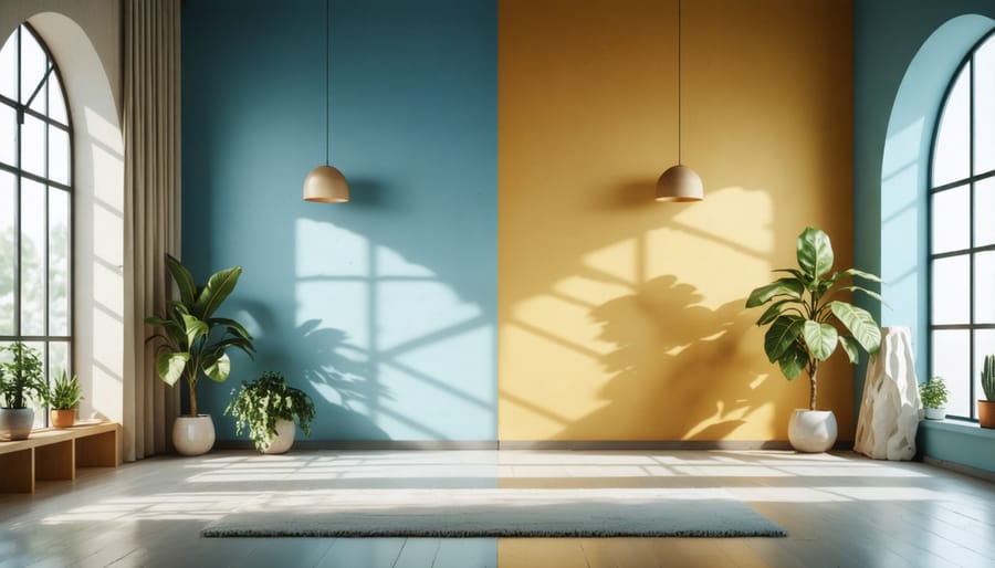
Color Temperature in Architecture
Color temperature plays a crucial role in shaping how we experience indoor spaces. Warm colors, like reds, oranges, and yellows, can make a room feel cozy and intimate – perfect for living rooms and dining areas where you want to encourage relaxation and social interaction. These colors remind us of sunlight and fire, creating an inviting atmosphere that naturally draws people together.
On the flip side, cool colors such as blues, greens, and purples tend to make spaces feel more open and airy. They’re excellent choices for bedrooms and bathrooms where you want to create a calm, serene environment. Cool tones remind us of water, sky, and nature, helping to lower stress levels and promote tranquility.
When planning your space, consider the room’s primary function and the mood you want to create. A home office might benefit from a mix of both – perhaps cool walls for focus with warm accents for energy. Remember that color temperature can also affect our perception of space: warm colors tend to make rooms feel smaller and more intimate, while cool colors can make them appear larger and more spacious.
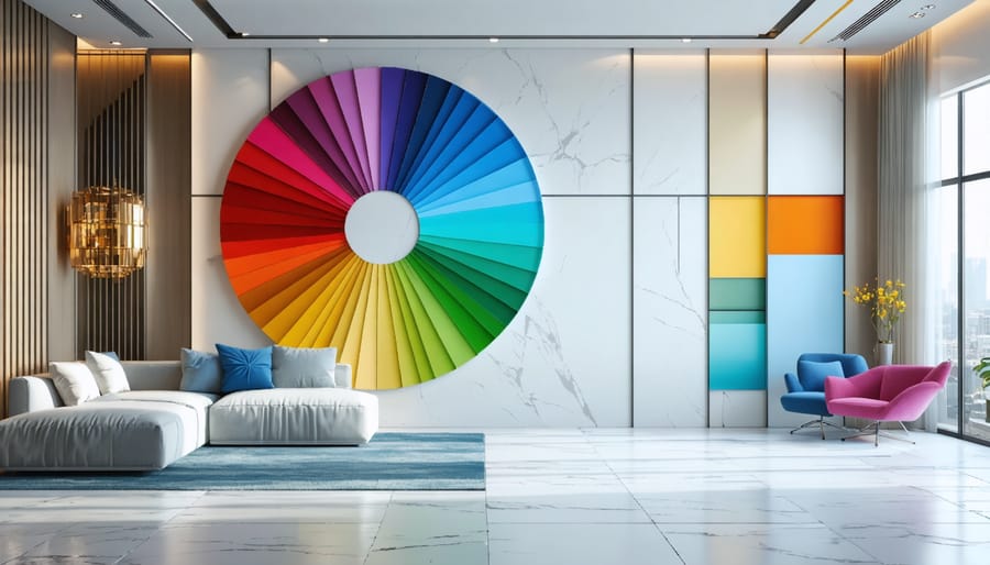
The Color Wheel in Spatial Design
Complementary Color Schemes
Complementary colors sit opposite each other on the color wheel, creating dynamic and energetic combinations that can transform any interior space. When used thoughtfully, these bold pairings can create stunning visual impact while maintaining harmony in your home.
The most common complementary pairs include blue and orange, purple and yellow, and red and green. While using these colors at full intensity might feel overwhelming, you can create sophisticated looks by playing with different shades and tones. For instance, try pairing a deep navy wall with copper or rust-colored furniture accents, or complement a soft lavender with muted yellow textiles.
Here’s a designer trick: use the 80/20 rule when working with complementary colors. Choose one color as your dominant shade (80%) and use its complement as an accent (20%). This creates balance while preventing the space from feeling too chaotic. For example, in a living room, you might paint the walls a calming sage green and add pops of burgundy through throw pillows, artwork, or decorative vases.
To soften the contrast between complementary colors, incorporate neutral elements like white, gray, or natural wood tones. These neutral bridges help the eye transition smoothly between the opposing colors while creating a more livable space. Remember, the goal is to create visual interest without overwhelming the senses.
When you’re ready to experiment with complementary colors, start small. Try introducing your chosen color combination through easily changeable elements like cushions, artwork, or rugs before committing to larger elements like wall colors or furniture pieces.
Analogous Color Harmony
Analogous color schemes are one of the most natural and harmonious approaches to architectural color design, drawing inspiration from nature itself. Think of a sunset’s gradual shift from orange to pink to purple – that’s analogous harmony at work. In interior spaces, this color strategy uses three to four colors that sit next to each other on the color wheel, creating a sense of visual comfort and flow.
To implement analogous colors in your space, start by selecting a dominant color that speaks to you – perhaps a calming blue or an energetic yellow. Then, choose two or three adjacent colors on the color wheel to complement it. For example, if you’ve picked blue as your primary color, you might incorporate blue-green and blue-violet as supporting hues.
This color harmony works exceptionally well in open-concept spaces where rooms flow into one another. You might paint your living room walls in a soft sage green, use forest green furnishings, and add yellow-green accents through plants and decorative pieces. The subtle variations create depth without jarring transitions.
Pro tip: Keep the intensity and brightness levels consistent across your chosen colors to maintain harmony. Use the 60-30-10 rule: 60% of your space in the dominant color, 30% in your secondary color, and 10% in your accent color. This creates a balanced, cohesive look that’s both sophisticated and welcoming.
Natural Light and Color Selection
Natural light plays a crucial role in how we perceive colors in our living spaces, and understanding this relationship can make or break your color choices. Throughout the day, sunlight changes in intensity and warmth, dramatically affecting how paint colors appear on your walls.
Morning light typically carries a cool, bluish tint that can make warm colors appear slightly muted while enhancing cool tones. As the day progresses, the afternoon sun brings out the truest version of your chosen colors, making this the ideal time to evaluate paint samples. During sunset, the golden hour casts a warm, orange glow that can intensify warm colors and soften cool ones.
Room orientation also significantly impacts color perception. South-facing rooms receive consistent, warm light throughout the day, making them versatile for most color choices. However, north-facing spaces can be trickier – they receive cooler, indirect light that might make some colors appear dull. If you’re looking to brighten north-facing rooms, consider using warmer hues or colors with yellow undertones to counteract the cool light.
Here’s a practical tip: always test paint samples at different times of the day before making your final decision. Place large swatches on multiple walls and observe how they look from morning to evening. Pay special attention to how the colors appear during the hours you’ll use the room most frequently.
Remember that artificial lighting will also affect your color choices, so consider your lighting plan when selecting paint colors. LED lights, incandescent bulbs, and fluorescent lighting can each dramatically alter how colors appear in your space after sunset. The key is to create a balanced lighting scheme that complements your chosen color palette throughout all hours of the day.
Color Psychology in Room Design
Room-Specific Color Choices
Different rooms serve distinct purposes, and their colors should reflect these functions. For living rooms, warm neutrals like beige or soft sage create a welcoming atmosphere perfect for socializing and relaxation. When it comes to bedrooms, cool, calming tones such as light blues and gentle lavenders promote better sleep and tranquility.
Kitchens benefit from energizing colors like sunny yellows or crisp whites, which stimulate appetite and encourage cleanliness. For home offices, productive greens and focused blues help maintain concentration while reducing eye strain. Bathrooms work well with spa-like aqua tones or clean whites, creating a sense of freshness and hygiene.
If you’re wondering about best color choices for hallways, consider light neutrals that create a seamless flow between rooms. For dining rooms, appetizing reds or rich earth tones can enhance the dining experience, while children’s rooms benefit from playful, softer versions of primary colors that stimulate creativity without overwhelming the space.
Remember to consider the room’s natural light exposure and size when making your final color selection. Darker rooms may need lighter shades to feel more spacious, while sun-filled spaces can handle deeper tones without feeling cramped.
Color theory in architecture is more than just choosing appealing colors – it’s about creating spaces that enhance our daily lives. Remember that warm colors can make large rooms feel cozier, while cool tones can help small spaces appear more open. When planning your color scheme, start with the room’s purpose and natural lighting, then build your palette around these factors. Don’t be afraid to experiment with color samples and take time to observe how different shades look throughout the day. Most importantly, trust your instincts while keeping basic color principles in mind. Whether you’re painting a single room or designing an entire home, understanding color theory will help you create harmonious, functional spaces that reflect your personal style while maintaining visual balance and comfort. Keep these guidelines handy as you embark on your next design project, and you’ll be well-equipped to make confident color choices.