The colors surrounding us shape more than just our home’s aesthetic – they fundamentally influence our mood, behavior, and well-being. Research shows that color choices in interior design can reduce stress by 60%, increase productivity by 15%, and dramatically improve sleep quality. From the calming blues of coastal retreats to the energizing yellows of modern workspaces, each color carries psychological weight that transcends cultural boundaries while honoring diverse interpretations.
Understanding color psychology transforms interior design from simple decoration into a powerful tool for emotional well-being. While Western cultures might associate white with purity and minimalism, Eastern traditions often view it as a symbol of mourning – highlighting how personal and cultural context shapes our color responses. This intersection of science and cultural awareness enables homeowners to create spaces that not only look beautiful but also support their emotional needs and cultural values.
By mastering the basics of color psychology, you gain the power to craft rooms that tell your unique story while promoting the specific emotional responses you desire. Whether you’re looking to create a productive home office, a relaxing bedroom sanctuary, or an energizing family space, the strategic use of color becomes your most versatile design tool.
The Universal Language of Color Psychology
Basic Color Associations
Colors have a profound impact on our emotions and can significantly influence our daily experiences. Understanding these basic color wheel principles helps create spaces that align with your desired mood and atmosphere.
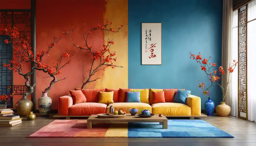
Blue often evokes feelings of calm, trust, and stability, making it perfect for bedrooms and home offices. Green connects us to nature, promoting balance and harmony – ideal for any room where relaxation is key. Yellow brings energy and optimism, though it’s best used as an accent to avoid overwhelming a space.
Red stimulates energy and appetite, working well in dining rooms or as bold accents, while purple traditionally symbolizes luxury and creativity. Orange combines yellow’s cheerfulness with red’s warmth, creating a welcoming atmosphere in social spaces. White opens up spaces and represents cleanliness, while black adds sophistication and drama when used strategically.
Brown grounds a space with its earthy stability, and gray provides a versatile neutral foundation that complements most color schemes. Understanding these associations helps you make informed choices that create the perfect emotional atmosphere in your home.
Scientific Basis of Color Impact
The fascinating world of color psychology in interior design is rooted in solid scientific research. When light enters our eyes, it triggers responses in our brain that influence both our emotional state and physiological reactions. Different wavelengths of light, which we perceive as colors, can affect our hormone production, blood pressure, and even body temperature.
For example, warm colors like red and orange can increase heart rate and stimulate brain activity, making us feel more energetic and alert. Cool colors such as blue and green have been shown to lower blood pressure and promote relaxation by triggering the release of calming hormones.
This biological response to color isn’t just in our heads – it’s measurable. Studies using brain imaging have revealed that different colors activate specific regions of our brain, leading to varied emotional and behavioral responses. Understanding these reactions helps us make informed choices about the colors we use in our spaces, allowing us to create environments that support our desired mood and activities.
The impact of color on our well-being is so significant that healthcare facilities often use specific color schemes to promote healing and reduce stress levels among patients.
Eastern vs. Western Color Interpretations
Asian Color Traditions
In Asian interior design traditions, colors carry deep cultural significance and symbolic meaning that extends far beyond aesthetic appeal. Red, for instance, is considered highly auspicious in Chinese culture, representing good fortune, celebration, and prosperity. Many homeowners incorporate red accents through decorative elements like throw pillows or artwork to invite positive energy into their spaces.
Gold and yellow hold royal connotations in many Asian cultures, particularly in Thailand and China, where these colors symbolize wealth and imperial power. Using metallic gold fixtures or yellow accent walls can create a sense of luxury while honoring these traditional associations.
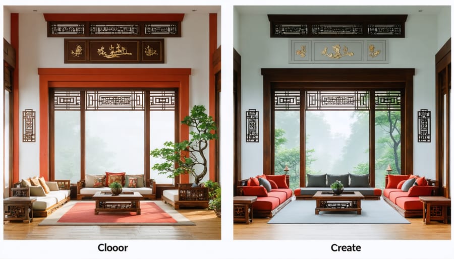
White plays a complex role across Asian design philosophies. In Japanese interiors, white represents purity and cleanliness, often used to create peaceful, minimalist spaces. However, in some Chinese contexts, white is associated with mourning, so it’s typically balanced with other colors when used in living spaces.
Green holds special significance in Islamic design traditions, representing paradise and nature. Many Middle Eastern interiors incorporate green through intricate patterns and textiles. Meanwhile, purple was historically reserved for nobility in Japanese culture, making it an excellent choice for creating elegant focal points in contemporary Asian-inspired rooms.
Understanding these cultural meanings can help you create more intentional and meaningful spaces, whether you’re drawing from your own heritage or respectfully incorporating Asian design elements into your home.
Western Color Preferences
In Western interior design, color preferences have been deeply influenced by historical, social, and cultural factors. Traditional Western homes often embrace a neutral base palette, with beige, white, and gray serving as foundational colors that create a sense of spaciousness and calm. These choices reflect a cultural emphasis on cleanliness, simplicity, and versatility.
Blue consistently ranks as the most popular color in Western societies, particularly in living spaces and bedrooms, where it’s associated with tranquility and stability. Green follows closely, drawing from Western culture’s connection to nature and the outdoors. These nature-inspired choices often appear in spaces designed for relaxation and rejuvenation.
Warm colors like red and yellow are typically used more sparingly in Western design, often appearing as accent colors rather than dominant schemes. This approach stems from the belief that bold colors should enhance rather than overwhelm a space. Purple, historically associated with luxury and royalty in Western culture, is often reserved for formal spaces or used as an elegant accent.
Recent trends in Western interior design show a growing appreciation for earth tones and organic color palettes, reflecting a modern desire to connect with nature while maintaining sophisticated aesthetics. This shift also demonstrates how Western color preferences continue to evolve while holding onto core principles of balance and harmony in design.
Modern Cultural Fusion in Color Design
Global Design Trends
Today’s global design scene showcases fascinating color trends that reflect our interconnected world. Scandinavian design continues to influence with its signature minimalist palette of whites, soft grays, and natural wood tones, creating serene spaces that combat the chaos of modern life. Meanwhile, Mediterranean-inspired interiors embrace warm terracottas, deep blues, and sun-bleached whites, bringing vacation vibes into everyday spaces.
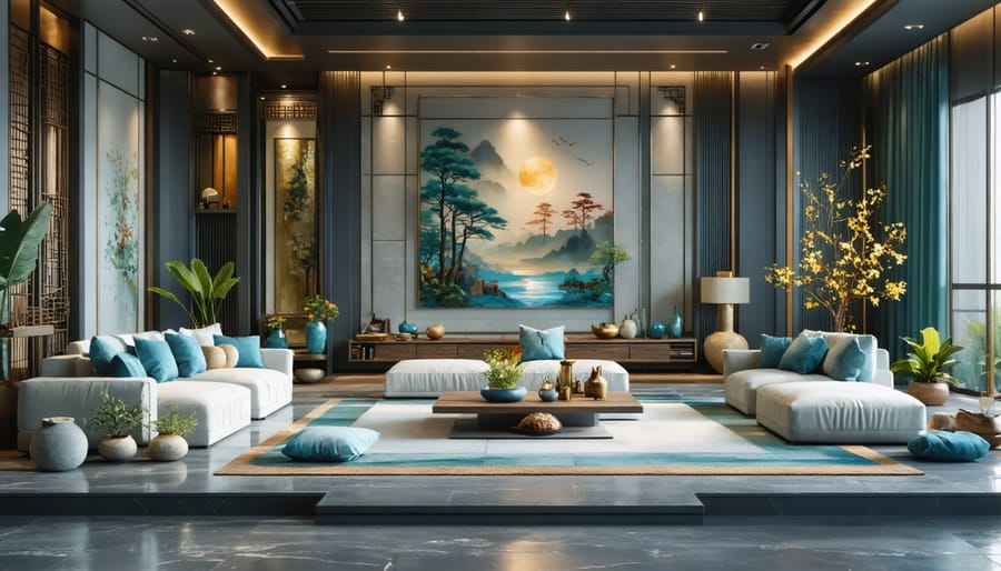
Japanese design philosophy has introduced darker, more contemplative tones paired with natural textures, while Indian-inspired interiors celebrate vibrant jewel tones like emerald green, royal purple, and deep gold. In Latin America, designers are mixing bold tropical colors with earthy neutrals, creating spaces that feel both grounded and energetic.
The rise of global fusion design has led to exciting color combinations that weren’t traditionally seen together. For instance, Moroccan-inspired deep oranges are being paired with Scandinavian grays, while Japanese minimalism meets Mexican color exuberance in contemporary spaces.
These international influences are encouraging homeowners to be more adventurous with color, moving away from one-size-fits-all approaches to create personally meaningful spaces that reflect their global perspectives and experiences.
Balancing Traditional and Modern
Blending traditional cultural elements with modern design doesn’t have to be challenging. Start by identifying key colors from your cultural heritage that resonate with you personally. For instance, if you’re drawn to the rich reds and golds of Chinese design, consider using these as accent colors against a contemporary neutral backdrop.
Create a cultural focal point by using traditional patterns or textiles in modern applications. A traditional Indian mandala pattern could become a stunning wallpaper feature wall, while Moroccan geometric patterns might appear in contemporary throw pillows or area rugs.
Balance is key – aim for an 80/20 ratio where modern elements comprise the majority, with cultural accents thoughtfully placed throughout. This prevents the space from feeling like a museum while honoring your heritage. Consider using traditional colors in unexpected ways, like incorporating Japanese indigo blue in sleek, modern furniture pieces.
Layer your cultural elements through accessories that can be easily changed or moved. Think carved wooden bowls, handwoven textiles, or artistic photographs of cultural landmarks. This approach allows you to adjust the traditional-to-modern ratio as your style evolves while maintaining a cohesive look that feels both personal and contemporary.
Practical Application Tips
Room-by-Room Color Selection
Let’s explore how to select the perfect colors for each room while honoring cultural preferences and practical needs. In the living room, warm earth tones like terracotta and deep browns often resonate with many cultures, creating a welcoming atmosphere for family gatherings. Consider using these as base colors, then adding accent pieces that reflect your specific cultural heritage.
For the kitchen, balance is key. While many Western designs favor white for cleanliness, some cultures embrace vibrant yellows or reds to stimulate appetite and conversation. Choose colors that both energize the space and align with your cultural comfort zone. Light neutral shades can help make your room look bigger, while still allowing for personalized touches.
Bedrooms deserve special attention as sleep sanctuaries. Blues and greens are universally calming, but their specific shades can vary by cultural preference. For instance, while soft sage might appeal to some, others might find deeper forest greens more meaningful and restful.
In home offices, consider colors that enhance focus while respecting cultural associations with success and productivity. Navy blue often transcends cultural boundaries as a color of trust and professionalism, while gold accents can symbolize prosperity in many traditions.
For bathrooms, create harmony between modern cleanliness and cultural comfort. While white remains popular, incorporating culturally significant accent colors through tiles or accessories can personalize the space without overwhelming it.
Children’s rooms offer opportunities to blend cultural storytelling with playful design. Choose colors that reflect both your heritage and your child’s personality, perhaps incorporating traditional patterns or symbols in modern ways.
Remember, these suggestions are starting points – your personal cultural background and family traditions should always guide your final choices. The key is creating spaces that feel authentic to your identity while maintaining functional beauty.
Mixing Cultural Color Schemes
Creating a harmonious blend of cultural color schemes begins with understanding and respecting the diverse meanings colors hold across different traditions. Start by identifying the key colors that resonate with your cultural heritage and those of other influences you’d like to incorporate. For instance, while red symbolizes luck and prosperity in Chinese culture, it might represent passion and energy in Western design.
To successfully mix cultural color preferences, consider using a dominant cultural palette as your foundation, then thoughtfully layer in complementary colors from other traditions. This approach helps achieve a perfect color balance while honoring multiple cultural influences.
Here are some practical tips for blending cultural color schemes:
1. Use neutral colors as bridges between different cultural palettes
2. Incorporate patterns and textures that reflect various cultural elements
3. Consider the room’s purpose and how different cultures approach similar spaces
4. Start with smaller accent pieces before making bold statements
5. Pay attention to the proportions of each cultural color influence
Remember that modern global design often celebrates cultural fusion. Don’t be afraid to experiment with unexpected combinations, such as Scandinavian minimalism with vibrant Mexican color accents, or Japanese zen aesthetics with Mediterranean warm tones.
When mixing cultural color schemes, focus on creating a space that feels authentic to your personal story while remaining respectful to the traditions that inspire you. The key is to find balance and harmony that speaks to your unique cultural experience while creating a welcoming atmosphere for everyone who enters your space.
As we’ve explored throughout this article, the psychology of color in interior design goes far beyond simple aesthetics – it’s deeply rooted in our personal experiences, cultural heritage, and emotional connections. Understanding these influences can transform how we approach color selection in our homes, creating spaces that truly reflect who we are and where we come from.
Remember that while certain colors may have universal psychological effects, your cultural background adds unique layers of meaning and emotional resonance. Don’t feel pressured to follow trending color schemes if they don’t align with your cultural values or personal preferences. Instead, embrace the colors that hold special significance in your heritage and incorporate them thoughtfully into your living spaces.
Whether it’s the vibrant reds of Chinese celebrations, the earthy terracottas of Mediterranean homes, or the cool blues of Scandinavian design, your cultural color preferences can create a home that feels authentically yours. Consider starting with small accents before making bold statements, and trust your instincts about what feels right in your space.
The most successful interior designs often come from a place of personal truth and cultural confidence. By understanding both the universal psychology of color and your unique cultural perspective, you can create living spaces that not only look beautiful but also tell your story and support your emotional well-being.
Take these insights as inspiration to experiment with colors that resonate with both your cultural background and personal style. After all, your home should be a reflection of your complete identity – past, present, and future.