Transform your bedroom into a personal sanctuary by choosing colors that align with the impact of color psychology and your desired atmosphere. Soft blues and gentle greens promote relaxation and better sleep quality, while warm neutrals like pale gray and cream create a timeless, versatile foundation. For smaller bedrooms, light colors like soft white or pearl expand the visual space, reflecting natural light to make the room feel more open and airy. Consider your bedroom’s natural lighting, existing furniture, and personal style preferences when selecting your perfect shade – the right color combination can dramatically influence both your mood and sleep quality while expressing your unique personality.
Calming Colors That Promote Better Sleep
Soft Blues and Their Sleep-Inducing Properties
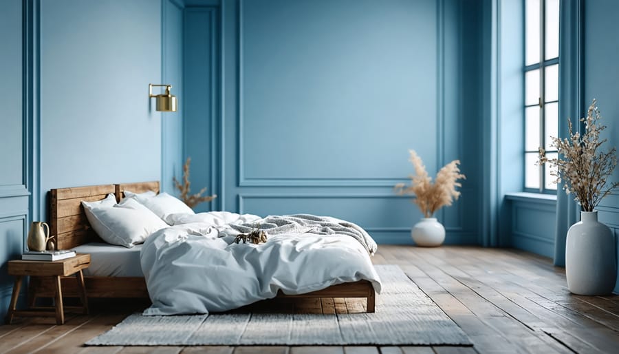
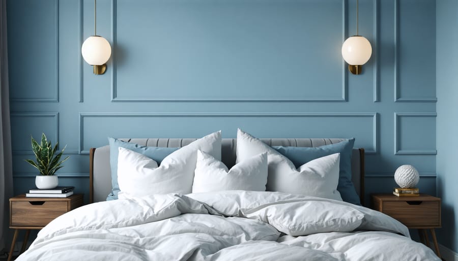
Soft blues have long been celebrated for their calming and sleep-promoting qualities, making them an excellent choice for bedroom walls. Light powder blues and gentle robin’s egg shades can lower blood pressure and heart rate, creating the perfect environment for rest and relaxation. These hues mirror the tranquil feeling of gazing at a clear sky, naturally signaling to our brains that it’s time to unwind.
Consider pale cerulean or dusty blue-gray tones, which work particularly well in rooms with natural light. These colors maintain their soothing properties even as lighting changes throughout the day. For a more sophisticated touch, seafoam blue or a soft pewter blue can add subtle depth while maintaining the peaceful atmosphere essential for quality sleep.
When selecting your perfect blue, opt for muted undertones rather than vibrant variations. Softer blues with gray or lavender undertones are especially effective at promoting restfulness, while still providing enough warmth to keep the room from feeling cold or clinical. These gentle shades also pair beautifully with various bedding colors and natural wood furnishings, making them versatile choices for any bedroom style.
Gentle Greens for Natural Tranquility
Green hues drawn from nature create a serene sanctuary that promotes relaxation and emotional balance. Soft sage green, reminiscent of garden herbs, brings the calming essence of the outdoors into your bedroom while maintaining a sophisticated aesthetic. For a lighter touch, consider pale pistachio or celadon green, which provide a gentle backdrop that works beautifully with both natural light and warm artificial lighting.
Muted olive tones offer a more grounded feel, perfect for those seeking an earthy connection, while seafoam green channels coastal tranquility. These nature-inspired greens pair exceptionally well with natural wood furniture, crisp white linens, and botanical accents.
Pro tip: Test your chosen green in different lighting conditions throughout the day. Many green tones can shift dramatically from morning to evening, so select a shade that maintains its soothing quality regardless of the time. For maximum serenity, opt for greens with a slight gray undertone – these colors tend to be less stimulating and more conducive to rest.
Add depth to your green palette by incorporating different textures through bedding and curtains, creating a layered, peaceful environment that promotes deep, restorative sleep.
Neutral Tones for Ultimate Relaxation
Neutral tones are the ultimate chameleons of bedroom design, offering a timeless foundation for relaxation. Soft beige creates a warm, cozy atmosphere while maintaining an airy feel, perfect for smaller spaces. Light gray adds sophistication and pairs beautifully with virtually any accent color or decor style. Consider warm greige (a blend of gray and beige) for the best of both worlds – it provides warmth while maintaining a modern edge.
For maximum versatility, look to pale taupe or cream colors, which can make your room feel larger while creating a serene backdrop for both modern and traditional furnishings. These neutrals work exceptionally well in rooms with natural light, as they reflect sunlight without becoming harsh or overwhelming. Pro tip: Choose neutrals with subtle undertones that complement your existing furniture and flooring to create a cohesive, peaceful sanctuary.
Colors to Consider Based on Room Features
Small Bedroom Color Solutions
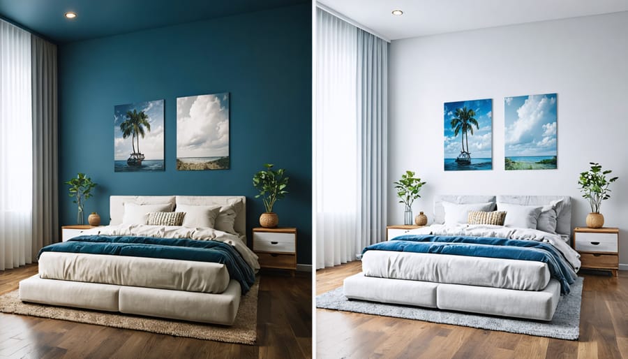
When working with a small bedroom, choosing the right paint color can make a dramatic difference in how spacious the room feels. Understanding colors that make rooms appear larger is key to creating an airy, open atmosphere. Light, cool-toned colors are your best friends in compact spaces. Soft whites, pale grays, and gentle blues reflect more light and create the illusion of depth, while darker colors tend to make walls appear closer.
Consider using pure white or cream for the ceiling to draw the eye upward and create a sense of height. Pale blue-grays and soft sage greens work wonderfully in small bedrooms, as they blend the space-expanding properties of light colors with nature-inspired tones that promote relaxation. For a modern twist, try pale blush pink or subtle lavender – these unexpected choices can make your room feel both larger and more inviting.
To maximize the effect, keep your color scheme consistent and avoid sharp contrasts that can break up the space. Paint trim and doors the same color as your walls to create a seamless look that extends your sight lines and makes the room feel more expansive.
Paint Colors for Low-Light Bedrooms
Dealing with a dimly lit bedroom doesn’t mean you have to settle for a gloomy space. The right paint colors can brighten dark spaces and create an inviting atmosphere, even with minimal natural light.
Light, warm-toned yellows like butter cream or pale honey can create the illusion of sunshine, making your room feel naturally brighter. Soft corals and peachy pinks reflect what little light there is while adding a cozy, welcoming vibe. For a more neutral approach, consider pearl white or ivory – these shades bounce light around the room without feeling stark or clinical.
Cool-toned options can work beautifully too. Pale lavender and silvery gray add sophistication while maximizing available light. Soft mint or sage green can bring a nature-inspired freshness that doesn’t overwhelm the space.
Pro tip: Choose paint with a satin or eggshell finish rather than matte. These slightly reflective surfaces help distribute light throughout the room, making it appear brighter and more spacious. Also, consider painting the ceiling a shade lighter than your walls to draw the eye upward and create the feeling of more height and openness.
Coordinating with Existing Furniture
When selecting your bedroom paint color, your existing furniture and décor should serve as key inspiration points. Start by identifying the dominant colors in your largest pieces, such as your bed frame, dressers, or accent chairs. For wooden furniture, note whether the undertones are warm (reddish-brown) or cool (gray-brown), and choose paint colors that complement these tones.
If you have colorful bedding or artwork, pick out secondary colors from these pieces to inform your wall color choice. For instance, if your comforter features navy and cream patterns, consider a soft gray or warm beige that will create harmony without competing for attention.
For neutral furniture pieces, you have more flexibility. Light-colored furniture works beautifully with both bold and subtle wall colors, while dark furniture typically pairs best with lighter wall colors to create balance. Don’t forget to consider your window treatments and area rugs – these elements should bridge your furniture and wall colors.
Pro tip: Before committing to a color, tape fabric swatches, paint chips, or photos of your furniture to your wall and observe how they interact throughout the day as natural light changes. This simple step can help you avoid costly color mistakes and ensure a cohesive look.
Color Combinations That Work
Primary and Accent Color Pairings
Creating perfect color combinations in your bedroom starts with choosing complementary primary and accent colors that work in harmony. A popular approach is the 60-30-10 rule, where your primary color covers 60% of the room, while secondary and accent colors take up 30% and 10% respectively.
For a serene atmosphere, pair soft sage green walls with warm cream accents, creating a nature-inspired retreat. Deep navy blue walls complement golden or brass accents beautifully, adding sophistication without overwhelming the space. If you prefer neutrals, consider warm greige as your primary color with charcoal gray accents for a modern, timeless look.
Light colors work exceptionally well with darker accents. Try pale lavender walls with deep purple accents for a romantic touch, or soft gray with navy blue for a sophisticated feel. For those seeking warmth, combine warm beige with terra cotta accents to create a cozy, inviting space.
Remember that accent walls don’t always need to be bold. Sometimes, a slightly darker or lighter shade of your primary color can create subtle depth without disrupting the room’s peaceful atmosphere. When selecting your combinations, consider your existing furniture and decor to ensure a cohesive look throughout the space.
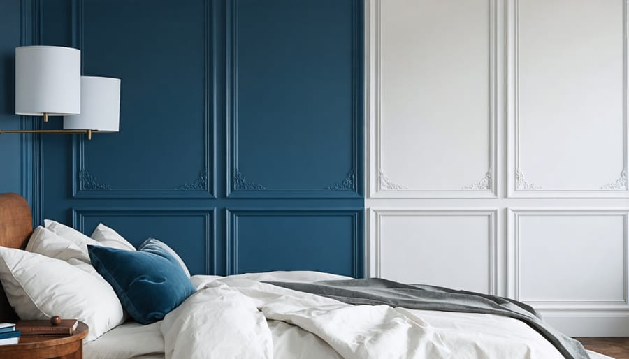
Creating Visual Interest with Multiple Shades
Creating depth and visual interest in your bedroom doesn’t always require multiple colors. Working with different shades of the same color, known as monochromatic design, can create a sophisticated and serene atmosphere that’s perfect for a bedroom.
Start by selecting your main color, then choose three to four variations of it – typically a lighter shade, your base color, and a darker tone. For example, if you’ve chosen sage green as your base, pair it with a pale mint for the ceiling and a deeper forest green for an accent wall.
To implement this effectively, follow the 60-30-10 rule: use your main shade on 60% of the room (usually the main walls), a lighter or darker variation on 30% (perhaps an accent wall or large furniture pieces), and the third shade on 10% (accessories and trim).
Consider these placement strategies:
– Paint the ceiling a shade lighter than your walls to create height
– Use darker tones on a feature wall to add depth
– Apply lighter shades around windows to maximize natural light
– Include the darkest shade in your accessories to ground the space
Remember to test your chosen shades in different lighting conditions before committing. Paint samples on large sheets of paper that you can move around the room, observing how they look during different times of day and with your artificial lighting.
Paint Finish Selection
Best Finishes for Bedroom Walls
Choosing the right paint finish is just as important as selecting the perfect color for your bedroom. Flat or matte finishes are ideal for bedroom walls, as they absorb light and help hide minor surface imperfections. This finish creates a soft, sophisticated look that’s particularly suitable for adult bedrooms and master suites.
Eggshell finish offers a subtle, low-luster look with slightly more durability than flat paint. It’s perfect for bedrooms that need a bit more protection against wear and tear, like children’s rooms, while still maintaining a warm, cozy atmosphere.
Satin finish provides a pearl-like appearance with medium durability. While it’s more commonly used in high-traffic areas, it can work well in bedrooms where you want a slight sheen that reflects just enough light to add dimension to your space.
Avoid semi-gloss or gloss finishes in bedrooms, as their high shine can be distracting and create unwanted glare. These finishes are better suited for trim work, doors, and areas that need frequent cleaning. Remember, the more sheen a finish has, the more likely it is to highlight wall imperfections.
Durability and Maintenance Considerations
When it comes to bedroom paint durability, the finish you choose is just as important as the color. Flat or matte finishes are popular for bedrooms because they hide wall imperfections well and create a soft, peaceful atmosphere. However, they can be trickier to clean and may need more frequent touch-ups.
Eggshell and satin finishes offer a sweet spot between durability and aesthetics. These finishes are easier to wipe down than flat paint while still maintaining a gentle, non-reflective appearance that’s perfect for bedrooms. They’re especially practical for kids’ rooms or guest bedrooms that see more activity.
For high-moisture areas like en-suite bathroom walls, consider pearl or semi-gloss finishes. While these might be too shiny for entire bedroom walls, they work well as accents or in areas that need frequent cleaning.
To maintain your bedroom paint’s appearance, dust walls regularly with a microfiber cloth and clean spots promptly with a gentle soap solution. Avoid harsh scrubbing, which can create shiny patches. Keep your bedroom well-ventilated to prevent moisture damage, and store touch-up paint for quick fixes when needed.
Choosing the perfect bedroom paint color is a personal journey that can transform your space into a peaceful sanctuary. Throughout this guide, we’ve explored how calming blues and soft greens can promote restful sleep, while warm neutrals and gentle earth tones create a welcoming atmosphere that works with any décor style. Remember that light colors can make smaller bedrooms feel more spacious, while deeper hues add drama and sophistication to larger rooms.
When making your final color selection, consider these key takeaways: always test paint samples in your space under different lighting conditions, factor in your room’s natural light exposure, and ensure your chosen color complements your existing furniture and textiles. The most successful bedroom colors are those that reflect your personal style while maintaining a relaxing atmosphere.
For a foolproof approach, start with a neutral base and build from there. Soft grays, warm beiges, and creamy whites provide excellent foundations that you can enhance with accent walls or decorative elements. Don’t be afraid to trust your instincts – the best color is one that makes you feel at home and relaxed.
Whether you choose a serene blue-gray, a sophisticated taupe, or a gentle sage green, focus on creating a space that promotes both rest and rejuvenation. With these guidelines in mind, you’re well-equipped to select a bedroom color that you’ll love for years to come.