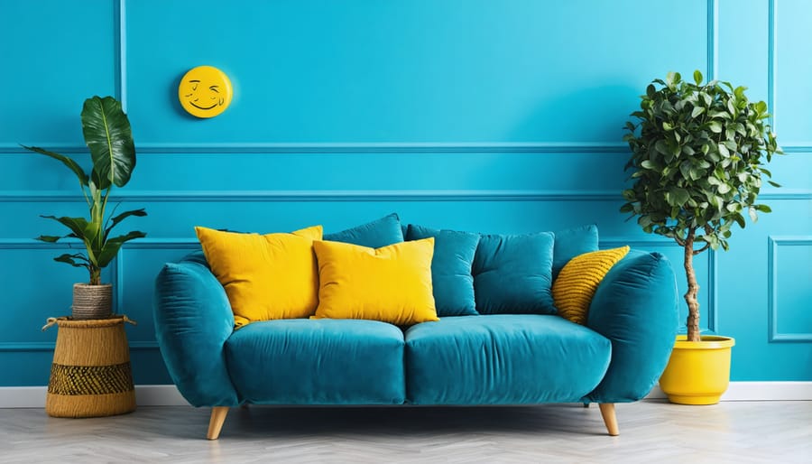
Transform your living space into a mood-enhancing sanctuary by mastering the psychological power of color. Every shade you choose creates an emotional response, influencing everything from your energy levels to your sleeping patterns. Beyond mere aesthetics, color psychology in interior design taps into our deepest psychological responses – blue calms a racing mind, yellow energizes a sluggish morning, and green nurtures creativity and growth.
Research shows that people make subconscious judgments about their environment within 90 seconds of initial viewing, and up to 90% of that assessment is based on color alone. Whether you’re designing a productive home office, a restful bedroom, or an inviting living room, understanding the psychological impact of your color choices can dramatically improve how you feel and function in your space.
This guide explores the fascinating intersection of color theory and human psychology, providing you with practical, science-backed strategies to harness the emotional power of color in your home. From selecting the perfect paint palette to incorporating accent pieces that enhance your well-being, you’ll discover how to create spaces that not only look beautiful but actively support your mental and emotional health.
How Colors Affect Your Mind and Emotions
The Science Behind Color Perception
Ever wonder why a sunny yellow kitchen makes you feel energized while a soft blue bedroom helps you unwind? It all comes down to how our brains process color. When light enters our eyes, it triggers a fascinating chain reaction that goes beyond simple vision. Our brain doesn’t just see colors; it experiences them on multiple levels.
Different wavelengths of light stimulate specific receptors in our retinas, which then send signals to the brain’s visual cortex. But here’s where it gets interesting: these signals don’t stop at visual processing. They travel to areas of the brain connected to emotions, memories, and even physical responses. This is why understanding color theory principles is crucial for creating spaces that feel right.
Your brain processes color information in milliseconds, triggering immediate emotional and physiological responses. Red might increase your heart rate slightly, while green can have a calming effect. This isn’t just personal preference – it’s rooted in both evolution and cultural conditioning. Understanding this connection between color perception and emotional response helps us make more informed choices when designing our living spaces.
Cultural and Personal Color Associations
When it comes to color preferences and emotional responses, our cultural background and personal experiences play a significant role. For instance, while white represents purity and cleanliness in Western cultures, it’s associated with mourning in many Eastern cultures. Similarly, red might evoke feelings of luck and prosperity for someone with Chinese heritage, while others might associate it with danger or passion.
Our personal experiences also shape how we react to different colors. The soft blue of your grandmother’s kitchen might bring comfort and nostalgia, while a particular shade of yellow might remind you of a happy summer vacation. These individual associations can be powerful determinants in creating spaces that feel personally meaningful and comfortable.
It’s essential to consider both cultural significance and personal meaning when selecting colors for your home. While color psychology provides general guidelines, your unique background and experiences should ultimately guide your choices. Don’t feel pressured to follow trends or conventional color rules if they don’t resonate with your cultural values or personal preferences. After all, your home should reflect your individual story and make you feel truly at home.
Room-by-Room Color Strategy
Living Room: Creating Balance and Harmony
The living room serves as the heart of your home, where family and friends gather to connect and unwind. Creating the right color balance here is crucial for fostering both social interaction and relaxation. Start with a neutral base color like warm beige or soft gray to establish a versatile foundation. These colors not only make your room look bigger but also provide flexibility for seasonal decor changes.
For a welcoming atmosphere, incorporate warm earth tones like terracotta or sage green as accent colors. These natural hues promote conversation while maintaining a sense of calm. If you’re looking to create energy and stimulate social interaction, consider adding pops of yellow or orange through throw pillows or artwork – but remember, less is more.
Blue tones can help balance the social energy with a sense of tranquility. A pale blue accent wall or accessories can create a peaceful backdrop for gatherings. For maximum versatility, stick to the 60-30-10 rule: use your main color for 60% of the room, a secondary color for 30%, and an accent color for 10%.
Remember to consider your room’s natural light when selecting colors. Rooms with abundant sunlight can handle cooler tones, while spaces with limited natural light benefit from warmer hues to create a cozy, inviting atmosphere.
Bedroom: Colors for Rest and Rejuvenation
Your bedroom should be a sanctuary that promotes restful sleep and morning rejuvenation. The right color choices can significantly impact both the quality of your sleep and your morning energy levels.
Soft blues reign supreme in bedroom color psychology, as they naturally lower blood pressure and heart rate, creating an ideal environment for rest. Think of peaceful sky blues or gentle sea foam tones that remind you of calm waters. These colors work particularly well when paired with crisp white trim or bedding.
Gentle neutrals like warm grays, soft taupes, and muted beiges also excel at creating a peaceful atmosphere. These versatile options provide a soothing backdrop while allowing flexibility in your decor choices. For a touch of warmth without overwhelming energy, consider pale lavender or the softest sage green, both known for their calming properties.
While bold colors can be invigorating, it’s best to avoid energetic reds, bright oranges, or stark whites in bedroom spaces. These stimulating colors can interfere with your natural sleep cycles. If you love vibrant hues, incorporate them through small accents or artwork rather than wall colors.
Pro tip: Test your chosen color in both natural daylight and evening lighting. What looks serene during the day should maintain its calming effect when you’re winding down for sleep. Consider using paint samples on different walls to observe how the light affects the color throughout the day.
Kitchen: Energizing and Appetizing Palettes
The kitchen is more than just a place to prepare meals – it’s the heart of your home where energy and appetite intersect. Color psychology plays a crucial role in creating an inviting and stimulating kitchen environment that can enhance both your cooking experience and eating habits.
Warm colors are traditionally considered appetite-stimulating, making them excellent choices for kitchen spaces. Red and orange tones can increase metabolism and stimulate conversation, perfect for family gatherings. However, use these bold colors strategically – perhaps as an accent wall or through decorative elements – to avoid overwhelming the space.
Yellow, reminiscent of sunshine and citrus fruits, brings cheerfulness and energy to your kitchen. It’s particularly effective in smaller or darker kitchens, as it can make spaces feel larger and more welcoming. Consider a buttery yellow for walls or bright yellow accessories for a mood-lifting effect.
For a balanced approach, incorporate white or cream as your base color. These neutral tones create a clean, fresh feeling while making your space appear larger and more organized. They also provide an excellent backdrop for colorful accessories and appliances.
Green, especially sage or mint tones, can add a natural, refreshing element while promoting feelings of health and wellness. This color works particularly well with wooden elements and plants, creating a connection to nature that can make your kitchen feel more nurturing and sustainable.
Remember to test your color choices under different lighting conditions, as kitchen lighting can significantly impact how colors appear throughout the day.
Home Office: Colors for Focus and Productivity
Creating a productive home office starts with choosing the right colors that enhance focus and minimize distractions. Blue is the star player here, known for boosting concentration and mental clarity. Consider painting your main walls in a soft, muted blue to create a calm yet stimulating environment. This color works particularly well when you need to tackle complex tasks or spend long hours at your desk.
For a balanced approach, incorporate green accents through plants or wall art. Green reduces eye strain and promotes a sense of balance, making it perfect for those marathon work sessions. If you want to design the perfect workspace, try combining these cool tones with warm neutrals like light gray or beige to maintain professionalism while avoiding a clinical feel.
White can help brighten your space and create a clean canvas for thinking, but avoid using it exclusively as it can feel stark and uninspiring. Instead, use it strategically on trim or ceiling to reflect light and make your office feel more spacious.
For creative professionals, small pops of yellow can stimulate innovation without overwhelming the space. Add these through accessories like desk organizers or artwork. Just remember to keep bold colors to a minimum – they should accent rather than dominate your workspace. The key is creating an environment that helps you stay focused while maintaining a comfortable, professional atmosphere.
Practical Color Implementation Tips
The 60-30-10 Rule
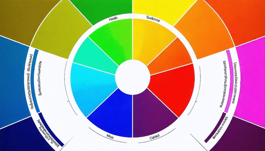
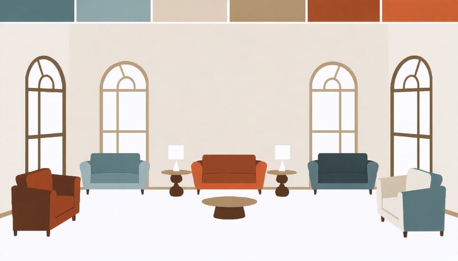
When it comes to creating a balanced and visually appealing space, the 60-30-10 rule is your secret weapon. This time-tested formula, which builds on color wheel principles, helps you distribute colors in your room with professional precision.
Here’s how it works: 60% of your space should feature your dominant color, typically applied to walls and large furniture pieces. This serves as your room’s backdrop and sets the overall mood. Choose a neutral or softer shade that you won’t tire of quickly.
The secondary color should occupy about 30% of the room through elements like accent furniture, window treatments, or area rugs. This color complements your dominant shade while adding visual interest and depth to the space.
The remaining 10% is reserved for your accent color – the bold, eye-catching element that brings your room to life. Think throw pillows, artwork, or decorative accessories. This is where you can be more adventurous with brighter or more saturated hues.
For example, in a living room, you might choose soft gray walls and large furniture (60%), navy blue curtains and rugs (30%), and yellow throw pillows and art pieces (10%). This distribution creates a naturally balanced space that’s both cohesive and visually interesting.
Testing Colors Before Committing
Before committing to a color scheme, it’s essential to test your chosen hues in your actual space. Start by purchasing sample pots of your selected colors – this small investment can save you from costly mistakes later. Paint large swatches (at least 2 feet square) on multiple walls in your room, as colors can appear differently depending on light exposure and surrounding elements.
Pro tip: Instead of painting directly on your walls, create moveable sample boards using foam core or poster board. This allows you to test the colors in different areas and against various furnishings without marking up your walls.
Observe these samples at different times of the day and under various lighting conditions – natural daylight, artificial evening light, and even on cloudy days. Take photos of the samples and review them on your phone, as this can sometimes reveal undertones that aren’t immediately apparent to the naked eye.
Consider testing your colors alongside existing furniture, flooring, and textiles. Remember that colors don’t exist in isolation – they interact with everything in your space. Keep your samples up for at least a week before making a final decision. This gives you time to experience how the colors make you feel and ensures you’re comfortable with your choice.
Don’t forget to test accent colors alongside your main color choices to ensure they create the harmony you’re seeking. This methodical approach to color testing will help you achieve a space that feels exactly right for you.
Working with Existing Elements
Working with existing elements doesn’t mean you have to compromise on your color psychology goals. Start by identifying your fixed features – things like flooring, countertops, or built-in cabinets – and treat them as your foundation. If you have warm-toned hardwood floors, for example, you can work with their natural energy by incorporating complementary earth tones in your design scheme.
For immovable elements that clash with your desired mood, try using transitional colors that bridge the gap. If you’re stuck with beige tiles but want a cooler, more calming atmosphere, introduce soft blues and greens through easily changeable elements like wall paint, textiles, and artwork.
Remember that neutrals are your friends when working around fixed features. They can help balance strong existing colors and create a harmonious transition between different elements. If you have a bold-colored kitchen backsplash, use neutral walls and accessories to prevent the space from feeling overwhelming.
Don’t forget the power of accents. Even with challenging fixed elements, you can shift the room’s emotional impact through strategic color placement. Use throws, pillows, artwork, and decorative objects in your chosen psychological color scheme. These smaller elements can have a big impact on the room’s overall feeling while working in harmony with existing features.
Finally, consider lighting. Natural and artificial light can significantly affect how colors appear and interact with fixed elements. Test your color choices at different times of day to ensure they create your desired psychological effect regardless of lighting conditions.
Common Color Mistakes to Avoid
Overlooking Lighting Effects
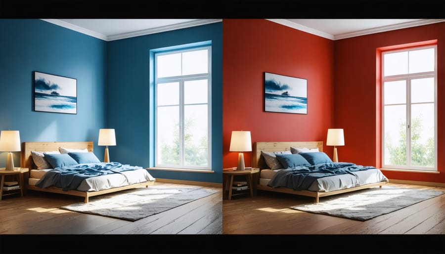
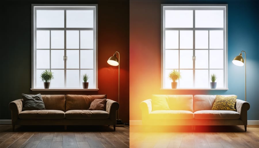
Lighting plays a crucial role in how we perceive colors in our homes, yet it’s often an overlooked aspect of interior design. Natural daylight shows colors in their truest form, but as the day progresses, these same colors can appear dramatically different. South-facing rooms typically enjoy warm, consistent light throughout the day, making colors appear brighter and more vibrant. In contrast, north-facing spaces receive cooler, indirect light that can make colors appear more muted – though there are clever ways to brighten dark rooms through strategic color choices.
Artificial lighting also significantly impacts color perception. Warm white bulbs (2700-3000K) enhance reds, oranges, and yellows while softening blues and greens. Cool white bulbs (4000-5000K) make blues and greens pop while potentially washing out warmer tones. This is why paint colors often look different in the store than they do at home – the lighting conditions are completely different!
When selecting colors for your space, always test samples under different lighting conditions throughout the day. View them during morning light, afternoon sun, and evening hours with your usual artificial lighting. This simple step can save you from surprising color shifts that might affect the mood you’re trying to create in your space.
Ignoring Color Temperature
One of the most common mistakes in interior design is overlooking the importance of color temperature when combining different hues. Warm colors, like reds, oranges, and yellows, can create cozy, inviting spaces that energize and stimulate. Cool colors, such as blues, greens, and purples, tend to promote relaxation and tranquility. When these temperatures clash without purpose, they can create visual discord and affect the room’s emotional impact.
To successfully work with color temperatures, start by identifying your room’s primary function. For social spaces like living rooms and kitchens, a dominant warm palette can encourage interaction and appetite. However, bedrooms and bathrooms often benefit from cool tones that promote rest and rejuvenation.
If you’re mixing temperatures, follow the 80/20 rule: use one temperature family for 80% of the space and accent with the opposite temperature for the remaining 20%. For example, a predominantly cool-toned bedroom could feature warm copper or brass accessories for balance and interest.
Remember that neutral colors also have temperature properties. Beiges and creams lean warm, while grays typically feel cooler. When selecting neutrals for your space, consider how they’ll interact with your chosen color scheme to create a harmonious environment that supports your room’s intended purpose and emotional atmosphere.
A well-balanced combination of warm and cool colors can create dynamic, welcoming spaces that feel both comfortable and visually interesting. The key is intentionality in your choices rather than random selection.
Understanding the psychology of color is a powerful tool that can transform your living spaces into environments that truly support your lifestyle and emotional well-being. As we’ve explored throughout this guide, each color carries its own unique energy and potential to influence our mood, behavior, and daily experiences.
Remember that while color psychology provides valuable guidelines, your personal preferences and existing décor should also play a crucial role in your color choices. Start small by experimenting with accent pieces or a feature wall before committing to major color changes. Pay attention to how different colors make you feel in various spaces and times of day.
Consider creating a color strategy for your entire home, ensuring that rooms flow naturally into one another while serving their intended purposes. Cool blues and greens can create tranquil bedrooms and bathrooms, while energetic yellows and oranges might better serve your home office or kitchen.
Don’t be afraid to break traditional rules if a particular color combination speaks to you. The most successful interior designs often reflect the personality and lifestyle of the inhabitants while incorporating color psychology principles thoughtfully.
Take the first step today by selecting one room to refresh with your newfound knowledge of color psychology. Your perfect color palette – and the positive energy it brings – awaits!