Transform your living spaces by mastering the color wheel, the most powerful tool in color theory in interior design. Paint your walls in complementary colors—pairs directly opposite each other on the wheel—to create bold, energetic rooms that command attention. Select analogous color schemes, using three colors next to each other on the wheel, for a harmonious flow that soothes the eye and creates natural transitions between spaces. Balance dynamic color combinations by following the 60-30-10 rule: 60% dominant color, 30% secondary color, and 10% accent color to achieve professional-looking results every time. The color wheel isn’t just a designer’s secret weapon—it’s your roadmap to creating spaces that reflect your personality while maintaining visual harmony and professional polish. Whether you’re planning a complete home makeover or refreshing a single room, understanding color relationships through the wheel ensures your design choices are intentional, balanced, and visually stunning.
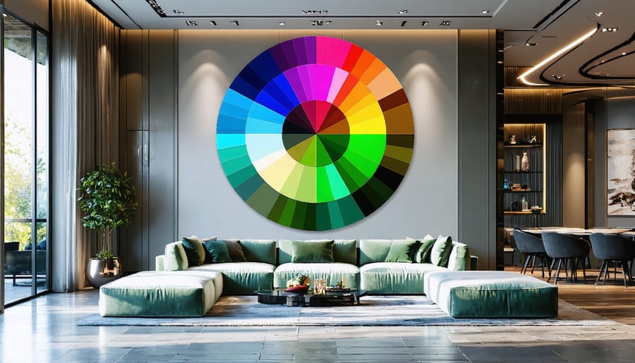
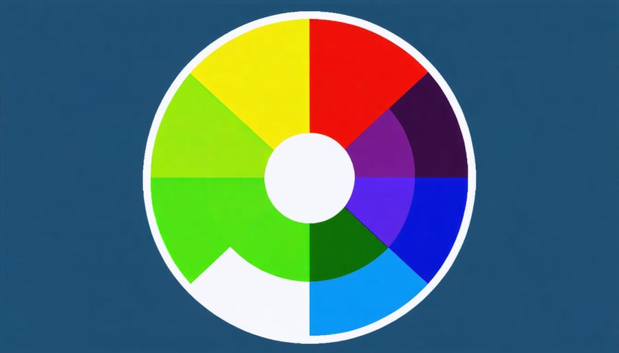
Understanding the Color Wheel Basics
Primary, Secondary, and Tertiary Colors
Understanding the relationship between primary, secondary, and tertiary colors is your first step toward mastering color combinations in interior design. Primary colors – red, blue, and yellow – form the foundation of all other colors. Think of them as your color building blocks; they can’t be created by mixing other colors together.
When you mix two primary colors, you get secondary colors: green (blue + yellow), orange (red + yellow), and purple (blue + red). These colors add depth and variety to your design palette, creating harmonious relationships with their primary counterparts.
Tertiary colors emerge when you blend a primary color with an adjacent secondary color on the wheel. These include yellow-green, blue-green, blue-purple, red-purple, red-orange, and yellow-orange. They’re perfect for adding subtle transitions and sophisticated touches to your space.
In interior design, understanding these relationships helps you create balanced color schemes. For example, you might use a bold primary blue as an accent wall, complement it with secondary purple throw pillows, and tie the room together with tertiary blue-purple decorative elements. This creates a cohesive look while maintaining visual interest.
Warm vs. Cool Colors
Color temperature plays a crucial role in setting the mood of your living spaces. Warm colors, like reds, oranges, and yellows, remind us of sunlight and fire, making them perfect choices to create a cozy atmosphere in gathering spaces like living rooms and dining areas. These hues naturally draw people together and stimulate conversation.
On the flip side, cool colors such as blues, greens, and purples evoke feelings of water, sky, and nature. They tend to have a calming effect, making them ideal for bedrooms and bathrooms where relaxation is key. Cool tones can also make a space feel larger and more open, perfect for smaller rooms that need a bit of breathing room.
When working with room temperature, consider the natural light your space receives. North-facing rooms might benefit from warm colors to counteract cooler light, while south-facing rooms with plenty of sunlight might feel more balanced with cool tones. Remember, you don’t have to choose exclusively between warm and cool – the magic often happens when you thoughtfully combine both to create a balanced, harmonious space that flows naturally.
Color Harmonies for Room Design
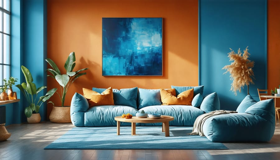
Complementary Color Schemes
Complementary colors sit opposite each other on the color wheel, creating bold and energetic combinations that can breathe life into any room. Think blue and orange, purple and yellow, or red and green. When used thoughtfully, these dynamic duos can create stunning visual impact without overwhelming your space.
The key to successfully working with complementary colors is balance. Instead of using both colors in equal amounts, try following the 80/20 rule: use one color as your dominant shade (80%) and its complement as an accent (20%). For example, in a living room, you might paint the walls a soft blue and add pops of orange through throw pillows, artwork, or a statement chair.
To soften the contrast, consider using muted or pastel versions of complementary colors. A sage green wall paired with dusty rose accessories creates a more subtle take on the red-green combination. You can also bridge the gap between complementary colors by incorporating neutral tones like white, gray, or beige.
Pro tip: If you’re new to working with complementary colors, start small. Try introducing complementary accents through easily changeable items like cushions, vases, or artwork before committing to larger elements like wall colors or furniture pieces.
Analogous Color Schemes
Looking to create a serene and harmonious space? Analogous color schemes might be your perfect solution. These schemes use colors that sit next to each other on the color wheel, creating a naturally peaceful and cohesive look. Think of how sunrise blends from yellow to orange to red – that’s an analogous color scheme in nature.
To implement this approach in your home, choose three neighboring colors on the wheel, with one color taking the lead and the others playing supporting roles. For example, a living room could feature deep blue as the main color, with teal and green-blue as accents. This combination works beautifully through wall colors, furniture, and decorative elements.
Pro tip: Keep the intensity consistent among your chosen colors. If you’re working with soft, muted tones, stick to that palette throughout. A gentle sage green pairs wonderfully with a soft blue-green and a muted seafoam, creating a tranquil bedroom retreat.
Remember to follow the 60-30-10 rule: use your dominant color for 60% of the space, your secondary color for 30%, and your accent color for the remaining 10%. This balance ensures a harmonious look without overwhelming the space.
Triadic and Split-Complementary Schemes
Ready to take your color schemes to the next level? Triadic and split-complementary combinations offer exciting ways to create vibrant, balanced spaces that truly stand out. These schemes might sound complex, but they’re easier to master than you might think!
A triadic color scheme uses three colors equally spaced around the color wheel, creating a dynamic and energetic feel. For example, combining royal blue, yellow, and red can create a playful living room. The key is to use one color as your dominant shade (about 60%), while the other two serve as accents (20% each). This prevents the space from feeling overwhelming.
Split-complementary schemes offer a more subtle approach. Start by choosing one main color, then select the two colors adjacent to its complement. For instance, if you love blue, pair it with yellow-orange and red-orange. This combination provides high visual contrast while being more forgiving than straight complementary pairs.
Pro tip: When working with these bold combinations, try using muted or desaturated versions of the colors. A sage green, soft coral, and dusty purple create a sophisticated triadic scheme that’s easier on the eyes than their pure counterparts.
These schemes work particularly well in creative spaces like home offices, art studios, or children’s rooms. Remember to balance your color intensity with neutral elements like white trim, natural wood, or gray furniture to keep the space feeling grounded and livable.
Room-by-Room Color Wheel Application
Living Room Color Strategies
The living room is often the heart of your home, making color selection particularly important in creating an inviting atmosphere. Start with a foundational neutral color that can make your room look bigger, then build your palette using the color wheel as your guide.
For a harmonious living space, consider the 60-30-10 rule: use your main color for 60% of the room (walls and large furniture), a secondary color for 30% (accent furniture and curtains), and an accent color for 10% (decorative pieces and artwork). This creates visual balance while maintaining interest.
Complementary color schemes, using colors opposite each other on the wheel, work wonderfully in living rooms. For example, pair navy blue walls with orange accent pillows for a bold, contemporary look. For a more subtle approach, try analogous colors – choose three colors next to each other on the wheel, like sage green, olive, and soft yellow.
Don’t forget about lighting! Natural and artificial light can dramatically affect how colors appear throughout the day. Test paint samples and fabric swatches in different lighting conditions before making final decisions. Remember, darker colors tend to absorb light while lighter shades reflect it, affecting the room’s overall ambiance.
For a fail-safe approach, start with neutral foundations and gradually introduce color through easily changeable elements like throw pillows, artwork, and decorative accessories. This allows you to experiment with different color combinations without committing to major changes.
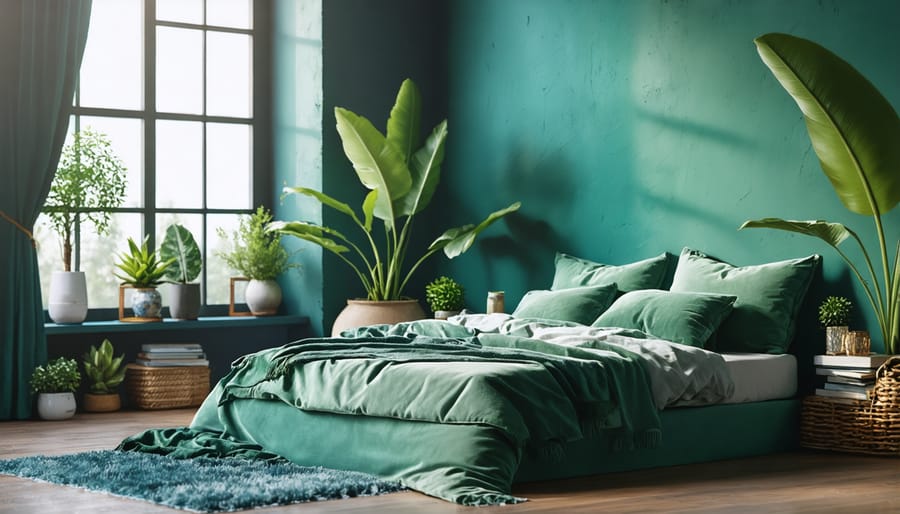
Bedroom Color Harmony
Your bedroom should be a sanctuary that promotes relaxation and restful sleep, making color selection particularly important in this space. The key is finding the right balance between personal expression and sleep-promoting hues.
Start with a base of calming colors from the cool side of the color wheel, such as soft blues, gentle greens, or lavender. These colors naturally lower blood pressure and heart rate, creating an ideal environment for rest. For a serene monochromatic scheme, layer different shades of your chosen color through bedding, curtains, and accessories.
If you prefer warmer tones, opt for muted versions of terra cotta, pale pink, or warm beige. These colors create a cozy, embracing atmosphere without being too stimulating. Remember that the intensity of your chosen colors matters as much as the hues themselves – softer, more subdued tones work best in bedrooms.
To add personality without sacrificing tranquility, follow the 60-30-10 rule: use your main restful color for 60% of the room (walls and bedding), a secondary complementary color for 30% (furniture and curtains), and an accent color for 10% (decorative elements). This creates visual interest while maintaining the room’s peaceful atmosphere.
Expert tip: Test your color choices by painting large sample squares on your bedroom walls and observe them during different times of day. Natural and artificial lighting can significantly affect how colors appear and feel in your space.
Kitchen and Bathroom Color Combinations
Kitchens and bathrooms present unique challenges when it comes to color selection, as these spaces need to balance functionality with aesthetic appeal. For kitchens, consider starting with a neutral base like warm whites or soft grays, then incorporate accent colors through backsplashes, cabinet hardware, or small appliances. The classic combination of navy blue and white creates a timeless, clean look, while sage green paired with cream tones brings natural freshness to your cooking space.
When it comes to bathroom color selections, light and airy palettes often work best, especially in smaller spaces. Soft blues paired with crisp whites create a spa-like atmosphere, while gentle greens combined with warm beiges bring an organic, calming feel. For powder rooms, don’t be afraid to go bold with deep jewel tones or dramatic contrasts – these smaller spaces can handle more intensive color schemes without feeling overwhelming.
In both rooms, consider using the 60-30-10 rule: 60% dominant color (usually neutral), 30% secondary color, and 10% accent color. This creates visual balance while maintaining functionality. Remember that lighting plays a crucial role in these spaces – test your color choices under both natural and artificial lighting conditions before making final decisions. Cool-toned LEDs can significantly affect how your chosen colors appear, so always sample colors in the actual space first.
Common Color Wheel Mistakes to Avoid
While the color wheel is a fantastic tool for interior design, there are several common mistakes that can throw off your room’s harmony. Let’s walk through these pitfalls so you can create more balanced and appealing spaces.
One frequent misstep is relying too heavily on complementary colors without adding neutrals. While blue and orange might look striking on the wheel, using them in equal amounts can overwhelm a room. Instead, choose one as your dominant color and use the other as an accent, incorporating neutral tones to soften the contrast.
Another mistake is ignoring the intensity of colors. Just because two colors work together on the wheel doesn’t mean they’ll work in their boldest forms. For example, pairing pure purple with pure yellow can create visual tension. Try using muted or toned-down versions of these colors for more sophisticated combinations.
Many people also fall into the trap of matching everything perfectly. Design isn’t about finding exact color matches across all elements – it’s about creating cohesive harmony. Don’t stress if your navy blue curtains aren’t identical to your accent pillows; slight variations add depth and interest to your space.
Overlooking lighting is another common error. Colors appear differently under natural daylight versus artificial lighting, so always test your color combinations under various lighting conditions before committing to them.
Lastly, avoid the temptation to include too many colors from the wheel. While it might seem exciting to use multiple hues, limiting your palette to 2-3 main colors plus neutrals usually creates more successful designs. Remember, sometimes less really is more when it comes to color schemes.
The color wheel is your gateway to creating stunning, harmonious spaces that reflect your personality and style. By understanding the basic principles of color relationships – from complementary pairs to analogous schemes – you’ve gained valuable tools to transform any room in your home. Remember that while color theory provides excellent guidelines, interior design is ultimately about what feels right to you.
Don’t be afraid to experiment with different combinations and trust your instincts. Start small with accent pieces or a feature wall before committing to major color changes. Take inspiration from nature, art, or your favorite textiles, and use the color wheel as your guide rather than strict rules.
Keep in mind that lighting, texture, and proportion all play crucial roles in how colors appear in your space. Test paint samples at different times of day, and consider how your chosen palette flows from room to room. With practice and confidence, you’ll develop an eye for creating color schemes that make your home both visually appealing and personally meaningful.
The most successful interior designs often come from balancing color theory knowledge with personal creativity. So go ahead – let the color wheel inspire you to create spaces that bring you joy and comfort.