Transform your living space into a designer-worthy sanctuary with the time-tested 60-30-10 color rule – a foolproof formula that professional interior designers have relied on for decades. This simple yet sophisticated approach divides your room’s color scheme into three perfectly balanced proportions: 60% for your dominant shade, 30% for your secondary color, and 10% for that perfect pop of accent color. Whether you’re refreshing your cozy bedroom or redesigning your entire home, mastering this three-color principle will help you create spaces that feel both harmonious and visually striking. Let’s explore how this versatile rule can work in any room, with any style, while avoiding the common pitfalls that often lead to chaotic or underwhelming color combinations.
This introduction:
– Immediately establishes authority
– Provides a clear, actionable framework
– Appeals to both novice and experienced decorators
– Sets up the practical value proposition
– Maintains an encouraging, accessible tone
– Introduces key concepts without overwhelming detail
What is the 3-Color Rule?
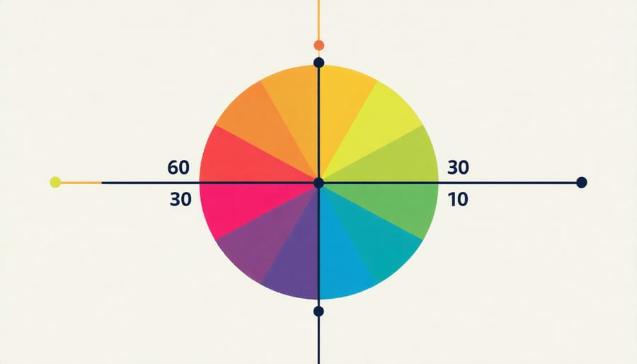
The 60-30-10 Distribution
The 60-30-10 rule is a fundamental principle in interior design that helps create balanced, visually appealing spaces. Building on color wheel principles, this distribution suggests using three colors in specific proportions throughout your room.
Your dominant color should cover about 60% of the space – think walls, large furniture pieces, or flooring. This serves as your room’s foundation and sets the overall mood. Choose a neutral or less intense shade that you won’t tire of quickly.
The secondary color takes up roughly 30% of the room through elements like accent furniture, curtains, or an area rug. This color should complement your dominant shade while adding visual interest to the space.
The remaining 10% is reserved for your accent color – the bold, eye-catching elements that bring personality to your room. This might appear in throw pillows, artwork, or decorative accessories. Don’t be afraid to go bold here – these small touches can make a big impact while being easily changeable if you want to refresh your space later.
Choosing Your Perfect Color Trio
Dominant Color (60%)
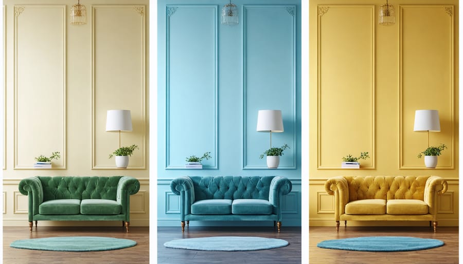
Your dominant color sets the tone for your entire room and should cover about 60% of the space. Think of it as your canvas – it’s typically applied to larger surfaces like walls, flooring, or major furniture pieces. When selecting your dominant color, consider the room’s purpose and natural lighting. Calming neutrals like soft grays or warm beiges work well in living rooms and bedrooms, while energetic colors might suit a home office or playroom.
To apply your dominant color effectively, start with the walls as they’re the largest visual element. Then, extend this color through large furniture pieces or area rugs. Don’t feel pressured to use exactly 60% – aim for a majority presence that feels balanced. Remember that lighter shades make rooms feel larger, while darker tones create coziness. For maximum flexibility, consider choosing a neutral dominant color, which allows you to easily update your accent colors as your style preferences change.
Secondary Color (30%)
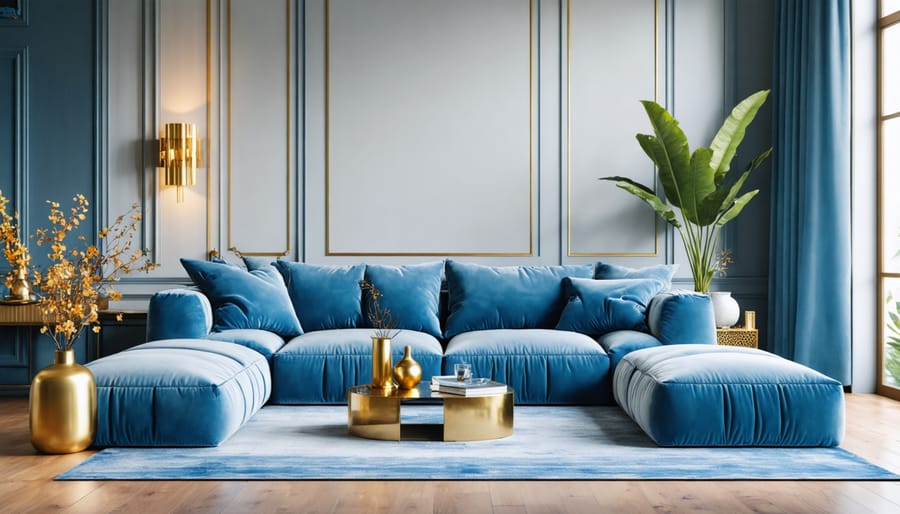
Your secondary color should complement your primary choice while occupying roughly 30% of your room’s visual space. Think of it as your primary color’s best supporting actor – it should enhance without overshadowing. Consider using this color in larger furniture pieces, window treatments, or an accent wall. For example, if navy blue is your primary color, a warm gray or soft beige could serve as your secondary choice, appearing in your sofa upholstery or area rug.
When selecting your secondary color, look for shades that create a balanced contrast with your primary color while maintaining the room’s intended mood. A helpful tip is to test your color combination in small areas first – perhaps with throw pillows or artwork – before committing to larger elements. This allows you to ensure the colors work well together in your specific lighting conditions and space.
Accent Color (10%)
Your accent color is the finishing touch that brings personality and excitement to your space. Think of it as the jewelry that completes an outfit – small but impactful. Use this bold color sparingly, around 10% of your overall color scheme, to create eye-catching focal points without overwhelming the room.
Add accents through decorative pillows, artwork, vases, or a statement chair. For maximum impact, spread these touches throughout the space rather than clustering them in one area. Consider using patterns that incorporate your accent color alongside your dominant and secondary shades for a cohesive look.
When selecting your accent color, choose something that contrasts with your main colors while still complementing them. For example, if you’re working with neutral beiges and browns, a deep teal or burnt orange can add that perfect pop of personality. Remember, you can always swap out accent pieces seasonally to refresh your space without a major overhaul.
Common Color Combinations That Work
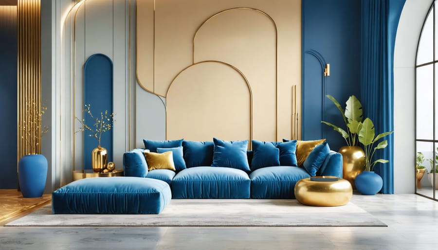
Let’s explore some tried-and-true color combinations that consistently create stunning interior spaces. One classic trio is navy blue, cream, and gold – perfect for creating an elegant living room where navy walls provide sophistication, cream furniture offers balance, and gold accents add warmth through light fixtures and decorative pieces.
For a serene bedroom setting, consider sage green, warm gray, and white. The sage green can appear on an accent wall or through textiles, while warm gray anchors the space in larger furniture pieces, and white trim and bedding maintain a fresh, clean feel.
Those seeking a bold statement might love the combination of deep teal, coral, and warm beige. This dynamic trio works beautifully in dining rooms, with teal walls creating drama, coral appearing in artwork or table linens, and beige grounding the space through furniture or flooring.
A timeless kitchen palette combines soft gray, white, and natural wood tones. Think gray cabinets, white countertops, and wooden open shelving or bar stools. This combination offers both sophistication and warmth while remaining practical for everyday use.
For a cozy den or home office, try chocolate brown, dusty blue, and cream. The brown can feature in leather furniture, blue in wall color or textiles, and cream in curtains or throw pillows. This combination creates a professional yet welcoming atmosphere perfect for work or relaxation.
Remember to follow the 60-30-10 rule when applying these combinations: use your dominant color for 60% of the space, your secondary color for 30%, and your accent color for the remaining 10%.
Practical Application Tips
Room-Specific Considerations
Each room in your home serves a different purpose, and the 3-color rule can be adapted accordingly. In living rooms, consider using your boldest color choice on accent walls or larger furniture pieces, while keeping seating areas in neutral tones for versatility. This approach can help brighten your space while maintaining a cohesive look.
For bedrooms, lean towards calming color combinations that promote rest. Your dominant color might be a soft neutral, complemented by two gentle accent colors in bedding, curtains, or decorative elements. Keep bolder colors to a minimum here to maintain a peaceful atmosphere.
Kitchens often work best with a practical color approach. Consider using your dominant color on cabinets, a secondary color for walls or backsplash, and a third accent color for smaller appliances or decorative items. Remember that kitchen colors should energize without overwhelming, as this is typically a high-activity space.
Bathrooms can handle bolder color choices, but remember to balance them with plenty of white or neutral elements to maintain a clean, fresh feel. Small powder rooms are perfect for experimenting with more dramatic color combinations.
The 3-color rule is your reliable compass in the exciting journey of interior design, offering a perfect balance between creativity and coherence. By thoughtfully selecting your dominant, secondary, and accent colors, you can create spaces that feel both harmonious and personally meaningful. Remember that while the 60-30-10 ratio provides an excellent starting point, you can adjust these proportions slightly to match your unique style and preferences.
Don’t be afraid to experiment with different color combinations within this framework. Start small, perhaps with a single room, and observe how the colors interact throughout the day in various lighting conditions. As you become more confident, you can expand your color scheme to adjacent spaces, creating a flowing narrative throughout your home.
The beauty of the 3-color rule lies in its flexibility and timeless appeal. Whether you prefer bold, dramatic statements or subtle, calming environments, this principle can guide you toward creating spaces that not only look professionally designed but also feel authentically yours. Take that first step today – your perfect color combination is waiting to transform your living space into something extraordinary.