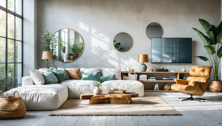
Transform your dark, cramped spaces into bright, airy sanctuaries by selecting the perfect paint colors that maximize natural light and create an illusion of openness. Pure white remains the gold standard for light reflection, with Benjamin Moore’s “White Dove” and Sherwin-Williams’ “Alabaster” leading the way as designer favorites. But don’t limit yourself – soft, warm grays like “Repose Gray” bounce light beautifully while adding subtle depth, while pale blues with gray undertones such as “Borrowed Light” create an ethereal, expansive feel that tricks the eye into perceiving more space. The secret lies not just in choosing light colors, but in understanding how paint finishes interact with your room’s natural and artificial lighting. A satin finish reflects up to 35% more light than flat paint, instantly brightening corners and lifting shadows that make rooms feel smaller. Whether you’re refreshing a basement apartment or maximizing a sun-filled living room, the right paint color serves as your most powerful tool for creating bright, welcoming spaces that feel larger than their square footage suggests.
How Light Affects Paint Colors
Natural vs. Artificial Light
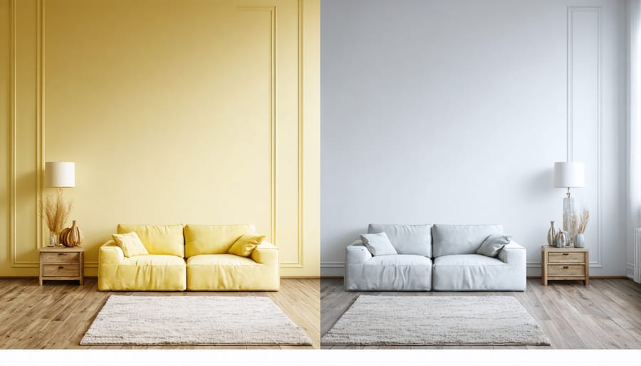
The way your chosen paint color appears can vary dramatically depending on the type of light it receives. While natural daylight offers the truest color representation, artificial lighting can significantly alter how paint colors look in your space. Consider implementing smart lighting design to maximize the impact of your paint choices.
Natural sunlight changes throughout the day, shifting from warm morning light to cooler afternoon rays. South-facing rooms receive the most consistent natural light, making them ideal for showcasing true paint colors. North-facing spaces tend to receive cooler, indirect light, which can make warm colors appear muted and cool colors more intense.
Artificial lighting presents its own considerations. LED bulbs typically provide cleaner, truer color representation, while traditional incandescent bulbs cast a warm, yellowish glow that can alter paint colors. Fluorescent lighting might make cool colors appear more intense and warm colors seem somewhat dull. To ensure your chosen paint color works in all conditions, test paint samples on your walls and observe them at different times of day and under various lighting conditions before making your final decision.
Room Orientation Matters
The direction your windows face plays a crucial role in selecting the perfect paint color for your space. North-facing rooms typically receive cooler, indirect light throughout the day, making them the most challenging to brighten. For these spaces, opt for warm whites, creamy yellows, or soft peaches to counteract the cool light.
South-facing rooms enjoy abundant warm light, giving you more flexibility with color choices. Here, you can experiment with cooler tones like pale blues and gentle grays without risking a gloomy atmosphere. East-facing rooms receive bright morning light but become darker in the afternoon, making light-to-medium warm neutrals ideal for maintaining brightness throughout the day.
West-facing rooms experience the opposite effect, with softer morning light and intense afternoon sun. Consider using muted, mid-tone colors that can balance both lighting conditions. Remember that natural light changes seasonally, so observe your room’s lighting patterns throughout different times of the day before making your final color selection.
Best Light-Enhancing Paint Colors
Warm Whites and Creams
When it comes to brightening a room, warm whites and creams are timeless choices that not only make your room look bigger but also create an inviting atmosphere. Unlike stark, clinical whites, these softer shades reflect light beautifully while maintaining a cozy feel.
Consider Benjamin Moore’s “Swiss Coffee,” a warm white with subtle yellow undertones that creates a gentle, welcoming glow. For a slightly richer option, “White Dove” offers a creamy finish that works wonderfully in both natural and artificial lighting conditions.
Sherwin-Williams’ “Alabaster” is another excellent choice, delivering a perfect balance between warm and cool undertones. This versatile shade plays well with any decor style and helps bounce light around the room without feeling too bright or harsh.
For those seeking a bit more depth, cream colors like “Natural Choice” or “Creamy” provide extra warmth while still maintaining that bright, airy feeling. These shades are particularly effective in north-facing rooms where natural light tends to be cooler.
Pro tip: When selecting warm whites and creams, always test your chosen color in different lighting conditions throughout the day. What looks perfect in morning light might appear differently in the evening, so take time to observe how the color shifts before making your final decision.
Soft Pastels
Soft pastels offer a perfect balance between color and brightness, creating an airy atmosphere without overwhelming the space. These gentle hues reflect light beautifully while adding a subtle touch of personality to your rooms. Blush pink, for instance, acts as a warm neutral that can make any room feel more inviting and spacious, especially during golden hour when natural light brings out its peachy undertones.
Mint green is another excellent choice, bringing a fresh, natural feeling while maintaining a light and open atmosphere. This calming shade works particularly well in bathrooms and kitchens, where it creates a clean, spa-like ambiance. For bedrooms and living spaces, consider powder blue – it mimics the sky and creates an expansive feeling overhead, especially when used on the ceiling.
Soft lavender is gaining popularity as a sophisticated alternative to traditional neutrals. It provides a barely-there wash of color that changes beautifully throughout the day as light shifts. For a truly versatile option, try pale butter yellow, which can make even north-facing rooms feel sunnier and more welcoming.
Pro tip: When working with pastels, opt for colors with a higher Light Reflectance Value (LRV) – ideally above 60%. This ensures the color will contribute to the room’s brightness rather than absorbing light. Also, consider pairing your chosen pastel with crisp white trim to enhance the brightening effect.
Light Neutrals
Light neutrals are the go-to choice for brightening any room, offering a perfect balance between warmth and freshness. Soft grays like “Agreeable Gray” or “Silver Drop” reflect light beautifully while maintaining a contemporary feel that works with virtually any decor style. These colors create an airy atmosphere without feeling stark or clinical.
Beige tones have evolved far beyond the boring basics of the past. Modern options like “White Sand” and “Alabaster” provide subtle warmth while maximizing light reflection. These shades work particularly well in north-facing rooms where natural light tends to be cooler, helping to create a more inviting atmosphere.
The rising star in the light neutrals family is greige – a sophisticated blend of gray and beige. Colors like “Revere Pewter” and “Edgecomb Gray” offer the best of both worlds, combining the contemporary appeal of gray with the welcoming warmth of beige. These versatile shades adapt beautifully to changing light throughout the day, ensuring your space feels bright and welcoming from dawn to dusk.
When selecting light neutrals, always test samples in your space and observe them at different times of day. The undertones become more apparent as the light changes, so what looks perfect in morning light might shift significantly by evening. Pro tip: Choose a color with an LRV (Light Reflectance Value) above 60 for maximum brightness.
Paint Finishes for Maximum Light Reflection
The finish of your paint plays just as crucial a role in brightening your room as the color itself. Think of paint finish as the final piece of the brightness puzzle – it can either amplify or diminish your room’s light-reflecting potential.
High-gloss finishes offer the most dramatic light reflection, bouncing up to 85% of light back into your space. While this makes them excellent for brightening rooms, they do tend to highlight wall imperfections, so they’re best reserved for trim work or perfectly smooth surfaces. Semi-gloss provides similar benefits with a more forgiving nature, reflecting 65% of light while being easier to clean and maintain.
Satin finish strikes an excellent balance for most living spaces. It reflects about 40-50% of light while providing a sophisticated, pearl-like appearance that works well in both traditional and modern settings. It’s particularly suitable for high-traffic areas and rooms that need frequent cleaning, like kitchens and bathrooms.
Eggshell finish, with its subtle sheen, reflects roughly 25-35% of light and has become increasingly popular for its ability to hide minor wall imperfections while still contributing to room brightness. It’s perfect for living rooms, bedrooms, and dining areas where you want a soft, welcoming glow.
Flat or matte finishes reflect the least amount of light (around 0-10%) and are best avoided in rooms where brightness is a priority. However, they can be useful on ceilings to minimize glare and create a more balanced lighting effect.
Pro tip: Consider using different finishes within the same room to create depth and maximize brightness. For example, pair eggshell walls with semi-gloss trim to add dimension while optimizing light reflection throughout the space. Just remember that higher-gloss finishes require more careful preparation and application for the best results.
Room-Specific Color Recommendations
Living Spaces
Living rooms and family rooms are the heart of your home, where natural brightness can make a significant impact on mood and atmosphere. Light-reflecting colors like Benjamin Moore’s “Cloud White” create an airy, open feeling while maintaining warmth and comfort. For a modern twist, try “Pale Oak” – a sophisticated greige that brightens spaces without feeling stark.
Soft blues like Sherwin-Williams’ “Sea Salt” work wonders in living areas, reflecting light while adding a subtle hint of color that promotes relaxation. This shade pairs beautifully with natural light and creates an expansive feel, especially in rooms with south-facing windows.
For those seeking more warmth, consider butter-yellow tones like “Sunlight” by Behr. These hues naturally amplify both natural and artificial light while creating a welcoming, cheerful atmosphere perfect for family gatherings. Just remember to choose a shade with subtle undertones to avoid overwhelming the space.
Cool neutral colors like “Gray Owl” by Benjamin Moore offer another excellent option. These versatile shades reflect light beautifully while providing a sophisticated backdrop for your furnishings. They’re particularly effective in rooms that receive limited natural light, as they help maximize whatever brightness is available.
Pro tip: Test your chosen color on multiple walls and observe it throughout the day. Light interaction varies significantly from morning to evening, affecting how bright and welcoming your space feels.
Bedrooms and Home Offices
When it comes to bedrooms and home offices, choosing the right paint color can transform these private spaces into bright, energizing environments while maintaining their comfort. For bedrooms, soft whites with warm undertones, like Benjamin Moore’s “White Dove” or Sherwin-Williams’ “Alabaster,” create a serene atmosphere while maximizing natural light.
Light blues, such as pale sky blue or seafoam, work wonderfully in both bedrooms and home offices. These colors reflect light effectively while promoting a sense of calm and focus. For a modern twist, try a gentle gray-blue that adds sophistication without darkening the space.
Home offices benefit from colors that enhance productivity while keeping the room bright. Soft sage green offers a perfect balance – it’s light enough to brighten the space while providing a connection to nature that can reduce eye strain during long work sessions. Pale yellow, like butter cream or champagne, brings warmth and energy without being overwhelming.
Pro tip: Consider the direction your room faces when selecting paint colors. North-facing rooms benefit from warmer whites and creams to counteract cool light, while south-facing rooms can handle cooler tones without feeling dark.
For optimal brightness, pair your chosen color with white trim and consider painting the ceiling one shade lighter than the walls. This creates a subtle lift that makes the room feel more spacious and luminous.
Brightening your room with the perfect paint color doesn’t have to be a daunting task. By focusing on light-reflective values and understanding how different colors interact with natural and artificial light, you can transform any space into a brighter, more welcoming environment.
Remember that whites, creamy neutrals, and pale pastels are your best allies in maximizing brightness, while cool-toned paint colors can help create an airy, expansive feeling. When selecting your perfect shade, always consider your room’s natural lighting conditions and existing décor elements.
Here are some final tips to ensure success in your bright room transformation:
– Always test paint samples in your space at different times of day
– Consider the room’s function when selecting brightness levels
– Use eggshell or satin finishes for optimal light reflection
– Don’t forget about ceiling color – a bright white can significantly impact overall room brightness
– Pair your paint choice with strategic mirror placement and good lighting
– Take into account your existing furniture and décor colors
Before making your final decision, collect paint chips and samples of your top choices and live with them for a few days. Watch how they change throughout the day and how they make you feel in the space. Trust your instincts – the right bright paint color should feel uplifting and create the atmosphere you’re hoping to achieve in your room.
By following these guidelines and paying attention to how different colors interact with your specific space, you’ll be well-equipped to choose the perfect bright paint color for your room’s transformation.