Texture gradient transforms how we perceive depth, distance, and color perception in interior spaces, serving as a powerful tool in home design. As surfaces extend into the distance, their texture patterns appear to compress and become finer, creating an intuitive sense of depth that our brains naturally interpret. This fundamental principle, first identified by psychologist James Gibson, explains why rough stone walls appear to recede while smooth surfaces advance in our visual field. Understanding texture gradient helps homeowners make informed decisions about wall treatments, flooring patterns, and fabric selections to create spaces that feel perfectly proportioned and visually balanced. Whether you’re planning a room makeover or choosing between different wall finishes, mastering this concept can transform your approach to interior design and spatial planning.
Understanding Texture Gradient in Visual Perception
What Makes Texture Gradient Special
Texture gradient is unique because it helps our brain understand depth and distance through subtle changes in surface patterns. Think about looking at a brick wall from different distances – up close, you can see each brick’s detailed texture, but from far away, the texture appears smoother and more compressed. This natural progression of texture detail serves as a reliable visual cue that our brains use automatically.
What makes it particularly special is how it works alongside other depth cues to create a complete picture of our environment. In home design, texture gradient plays a crucial role in how we perceive room depth and spatial relationships. For example, when you look at a textured carpet extending from near to far, the way the pattern gradually becomes more compressed helps your brain instantly calculate the room’s dimensions.
Understanding texture gradient can help you make more informed choices about patterns and materials in your space, ultimately creating more visually balanced and comfortable environments.
The Psychology Behind Surface Perception
Our brains are remarkable at processing texture information, helping us understand depth and distance in our everyday environments. When you look at a surface, your brain automatically analyzes how the texture patterns change from near to far, creating a sense of perspective and space. This natural ability helps you judge distances and makes spaces feel more three-dimensional.
Think about looking at a tiled floor stretching away from you – the tiles appear larger and more detailed up close, becoming smaller and less distinct as they recede into the distance. This gradual change in texture appearance is something our visual system processes automatically, helping us navigate spaces safely and understand spatial relationships intuitively.
Understanding how our brains interpret texture can help you make better design choices in your home. By working with, rather than against, these natural perceptual tendencies, you can create spaces that feel more balanced and harmonious to the eye.
How Different Textures Affect Color Appearance
Smooth vs. Rough Surfaces
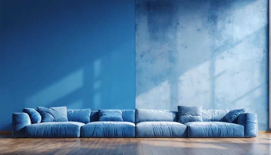
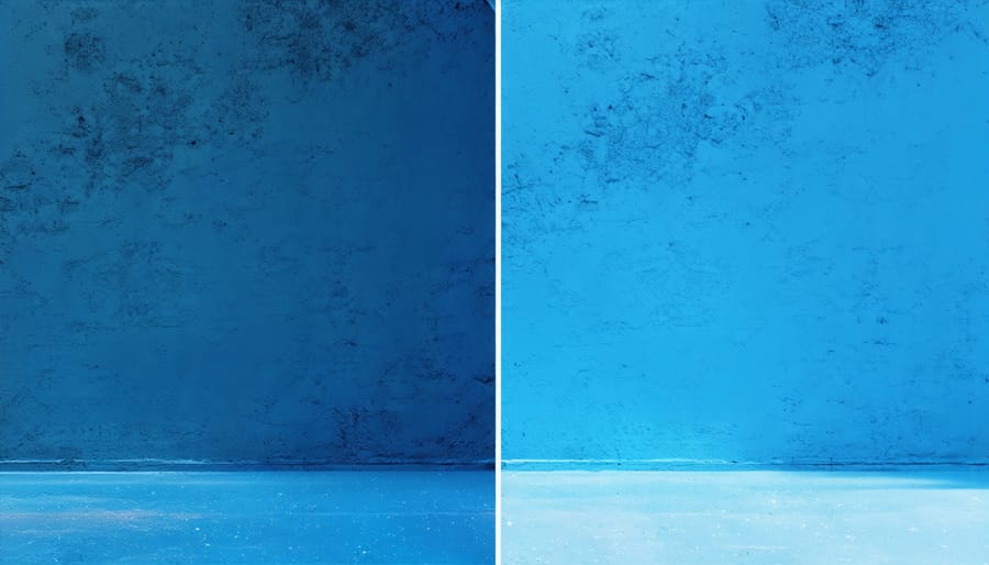
The interaction between surface texture and color perception plays a crucial role in how we experience our living spaces. Smooth surfaces tend to reflect light more uniformly, creating a cleaner, more consistent color appearance. Think of a freshly painted wall with a glossy finish – the color appears more vibrant and intense because light bounces off evenly, creating a mirror-like effect.
In contrast, rough surfaces scatter light in multiple directions, which can make colors appear slightly muted or varied. Imagine a textured wall with a stucco finish – the same paint color might look slightly different across the surface due to the way light interacts with the uneven texture. This variation creates depth and visual interest, but it can also make the color appear less saturated.
When planning your interior design, consider how different surface textures will affect your chosen colors. A smooth surface might be perfect for showcasing bold, dramatic colors in modern spaces, while rough textures can add character to neutral tones in rustic or traditional settings. The interplay between texture and color can create fascinating visual effects – smooth surfaces often make spaces feel more contemporary and sleek, while textured surfaces add warmth and dimension.
Professional designers often use this knowledge to their advantage, combining different surface textures to create dynamic, layered spaces that engage the eye and enhance the overall aesthetic appeal of a room.
Light Interaction with Textured Surfaces
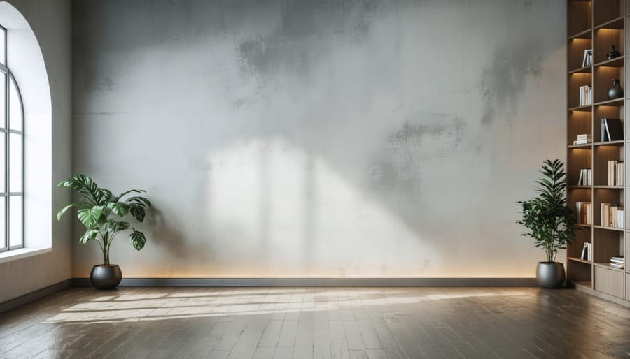
When light meets a textured surface, something fascinating happens that directly impacts how we perceive depth and form in our environment. The way light interaction with surfaces varies dramatically based on their texture, creating what psychologists call the texture gradient effect.
Smooth surfaces tend to reflect light uniformly, creating an even appearance that can sometimes appear flat. However, when light hits a textured surface, it bounces off at various angles, creating a pattern of highlights and shadows. These variations in light reflection help our brains interpret the surface’s characteristics and its distance from us.
Think about running your hand over different wall finishes in your home. A smooth painted wall reflects light evenly, while a textured wallpaper creates subtle shadows and bright spots. This interplay between light and texture provides vital visual cues that help us understand the physical properties of surfaces and their spatial relationships.
In interior design, understanding this principle helps create more engaging spaces. Rough textures typically absorb more light and create deeper shadows, making them appear closer, while smoother surfaces reflect more light and can make spaces feel more open and distant. This knowledge is particularly valuable when choosing wall treatments and decorative elements to achieve specific visual effects in your home.

Practical Applications in Home Design
Choosing the Right Texture for Your Colors
When selecting textures to complement your color choices, start by considering the mood you want to create in your space. Smooth textures tend to make colors appear more vibrant and crisp, while rough textures can soften and add depth to your chosen hues. For instance, a glossy finish on walls will make bold colors pop dramatically, whereas a matte or textured finish creates a more subtle, sophisticated look.
Light plays a crucial role in how texture affects color perception. Before finalizing your texture choice, observe how different lighting conditions interact with your selected colors and textures throughout the day. Natural daylight will reveal texture details more clearly, while artificial lighting can either enhance or diminish textural effects.
Consider the scale of your space when pairing textures with colors. Larger rooms can handle more pronounced textures and deeper colors, while smaller spaces often benefit from smoother textures and lighter shades to maintain an open feel. Mix and match different textures strategically – combine rough with smooth, or matte with glossy – to create visual interest without overwhelming the space.
Remember that texture can also affect color temperature. Rough textures tend to make colors appear warmer, while smooth textures can cool them down. Use this knowledge to your advantage when trying to achieve specific emotional responses in different rooms of your home.
Common Texture-Color Combinations
When it comes to creating visually appealing spaces, pairing textures with successful color combinations can dramatically enhance the perception of depth and interest in your rooms. In living spaces, combining plush velvet upholstery in deep blues with rough-woven natural fiber rugs creates a rich, layered effect. Kitchen designs benefit from smooth glossy tiles paired with matte finishes in warm earth tones, while incorporating wooden elements adds natural texture that complements both light and dark color schemes.
For bedrooms, soft, tactile textures like chenille or cotton in neutral shades create a serene atmosphere, while adding metallic accents through light fixtures or decorative pieces can introduce subtle shimmer without overwhelming the space. Bathrooms shine when smooth porcelain is contrasted with textured stone tiles, especially in monochromatic color schemes that emphasize the interplay of surface variations.
Home offices benefit from a mix of sleek, modern surfaces in cool grays or whites paired with natural textures like cork boards or woven baskets, which help maintain focus while adding visual interest. Remember that lighting plays a crucial role in how these texture-color combinations are perceived, so consider both natural and artificial light sources when planning your space.
Design Tips for Texture and Color Success
Ready to transform your understanding of texture gradient into beautiful home design? Here are some practical tips to help you create visually engaging spaces that feel just right.
Start by layering textures from rough to smooth in your line of sight. Place coarser materials like natural stone or rustic wood in the foreground, transitioning to smoother surfaces like polished metals or glass as you move deeper into the space. This creates a natural visual flow that guides the eye through the room.
When combining colors and textures, remember that darker, rougher textures appear closer while lighter, smoother ones recede. Use this to your advantage by incorporating darker, textured elements in areas you want to emphasize, and lighter, smoother finishes in areas you want to feel more spacious.
Consider these winning texture-color combinations:
– Matte charcoal walls with glossy white trim
– Rough linen upholstery with sleek leather accents
– Textured wallpaper paired with smooth painted surfaces
For small spaces, use finer textures and lighter colors toward the back of the room to create depth. In larger rooms, bold textures and deeper colors can help bring distant walls closer, making the space feel more intimate.
Remember to maintain balance – too many competing textures can overwhelm the senses. Choose one dominant texture as your anchor, then layer in complementary textures thoughtfully to create a harmonious design that feels both intentional and inviting.
Understanding texture gradient is a powerful tool in creating visually appealing and psychologically impactful spaces. By recognizing how our brains interpret texture changes to perceive depth and distance, we can make more informed design choices in our homes. Whether you’re painting a feature wall or selecting wallpaper patterns, consider how texture gradients can enhance your space’s visual interest and depth perception. Start small by experimenting with textured throw pillows or varying wall finishes in a single room. Remember, texture isn’t just about what you can touch – it’s about creating visual experiences that make your space more engaging and dynamic. As you plan your next home improvement project, pay attention to how different textures interact with lighting and color to create the perfect atmosphere for your space.