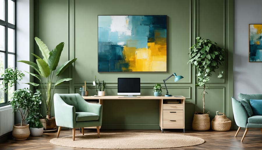
Transform your home office into a vibrant, productivity-enhancing space with strategic color choices that boost your productivity. Paint your walls a calming sage green to reduce eye strain and promote focus during long work sessions. Incorporate energizing blue accents through artwork or accessories to stimulate creative thinking and maintain mental clarity. Layer neutral tones like warm grays or soft beiges as foundation colors, then add purposeful pops of yellow or orange in small doses to inspire optimism and innovation without overwhelming the space.
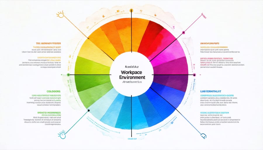
The psychology of color directly impacts your work performance, mood, and creativity levels. Whether you’re conducting virtual meetings, tackling detailed projects, or brainstorming new ideas, your home office color scheme sets the foundation for success. Modern color theory suggests that the right combination of hues can significantly enhance concentration, reduce stress, and create an environment that adapts to various work modes throughout the day.
Choose colors that reflect both your personal style and professional needs, understanding that the perfect palette balances aesthetic appeal with functional benefits. Consider natural light exposure, room size, and your specific work activities when selecting your ideal color combination.
How Colors Impact Your Work Performance
The colors surrounding us while we work do more than just please the eye – they can significantly influence our productivity, mood, and even decision-making abilities. Scientific studies have shown that different colors trigger specific responses in our brains, affecting everything from our stress levels to our creative output.
Blue, often found in nature’s sky and water, has been proven to enhance focus and productivity. It stimulates the mind while promoting a sense of calm, making it an excellent choice for tasks requiring concentrated attention. If you frequently work with spreadsheets or need to maintain focus during long meetings, incorporating blue into your office space could be particularly beneficial.
Green, meanwhile, strikes a perfect balance between stimulating and soothing. Associated with nature and growth, it’s been shown to reduce eye strain and promote creativity. Studies suggest that even a glimpse of green can boost creative performance by up to 20%, making it ideal for writers, designers, or anyone whose work requires innovative thinking.
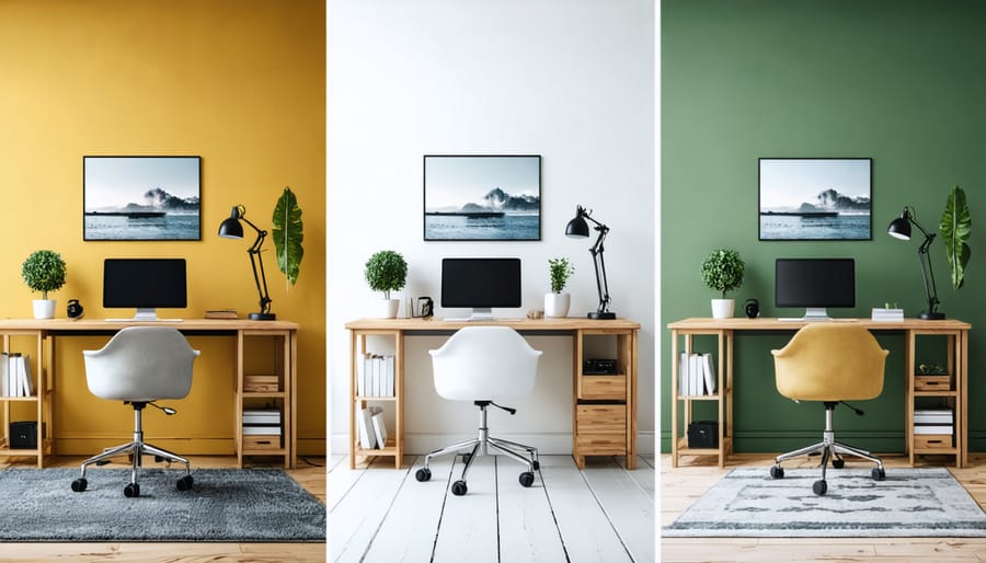
Yellow brings energy and optimism to your workspace. This sunny hue stimulates the production of serotonin – our body’s natural mood lifter. However, use it sparingly, as too much yellow can be overwhelming and potentially increase anxiety levels.
For those seeking enhanced concentration and reduced stress, soft purple tones can work wonders. This royal color combines the stimulating properties of red with the calming effects of blue, creating a balanced environment that supports both analytical thinking and creativity.
Red, while energizing, should be used cautiously in a home office. It can increase heart rate and energy levels, which might be beneficial for short bursts of activity but could be overwhelming for extended work periods. Consider using it as an accent color rather than a dominant shade.
When selecting colors for your home office, remember that personal preference plays a crucial role. While color psychology provides valuable insights, the most productive environment will be one where you feel comfortable and motivated. Consider testing different colors in small areas before committing to a full room makeover, and pay attention to how different shades affect your work performance throughout the day.
Best Color Schemes for Different Work Styles
Colors for Creative Professionals
For creative professionals, your home office color palette can be a powerful tool for sparking inspiration and maintaining creative flow. Deep blues and teals are excellent choices, as they promote both focus and imaginative thinking while creating a sense of depth in your workspace. Consider pairing these with energetic accent colors like coral or mustard yellow to stimulate innovative ideas.
Designers and artists often benefit from a neutral base of warm grays or soft whites, which provide the perfect backdrop for creative work without competing for attention. Add pops of vibrant colors through artwork, desk accessories, or an accent wall to keep the energy high without overwhelming the space.
For maximum creative impact, try incorporating color blocking techniques using complementary colors like purple and yellow or blue and orange. This creates visual interest and can help define different work zones in your office. Remember to include at least one calming color, such as sage green or pale lavender, to balance the more stimulating hues and prevent creative burnout during long work sessions.
Make sure to test your chosen colors in different lighting conditions, as natural and artificial light can significantly affect how colors appear and influence your creative process throughout the day.
Colors for Focus-Intensive Work
When it comes to creating a workspace that can enhance your focus and productivity, certain color combinations have proven particularly effective. Soft blues and gentle greens are excellent foundation colors, as they promote concentration while maintaining a sense of calm. Consider painting your main walls in a muted sage green or a serene powder blue to create a distraction-free environment.
For maximum focus, pair these base colors with neutral accents in white, light gray, or warm beige. These combinations help reduce visual noise while keeping your space professional and inviting. If you find yourself frequently participating in video calls, avoid bright or deeply saturated colors that might be distracting on camera.
A clever trick is to use color blocking with these focus-friendly shades. Paint one wall in a slightly darker tone of your main color to create subtle depth without compromising concentration. For those who need an occasional creativity boost, incorporate small pops of energizing yellow or purple through accessories rather than permanent fixtures. This approach maintains the room’s focus-oriented atmosphere while providing visual interest when needed.
Colors for High-Energy Tasks
For those high-energy tasks that require maximum focus and productivity, vibrant colors can help create the perfect energizing environment. Bold yellows can boost creativity and optimism, making them ideal for brainstorming zones. Consider painting an accent wall in sunny yellow or incorporating pops of citrus through artwork and accessories. Orange tones can spark enthusiasm and sociability – perfect for collaborative spaces or video conference areas. To maintain balance, pair these energetic hues with neutral grays or whites to prevent overstimulation. Red accents, while powerful, work best in small doses through desk accessories or art pieces, as they can increase heart rate and energy levels. For a more subtle approach, try incorporating emerald green, which provides energy while maintaining a connection to nature and harmony. Remember to test your chosen colors in small areas first, as lighting can significantly impact how energizing shades appear throughout the day.
Practical Color Application Tips
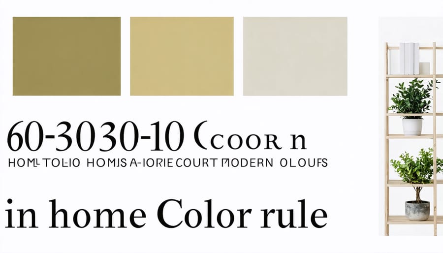
The 60-30-10 Rule
The 60-30-10 rule is a tried-and-true interior design principle that can help you create a perfectly balanced home office color scheme. Start by selecting your dominant color, which will cover about 60% of the space – typically your walls and larger furniture pieces. This should be a color that promotes the atmosphere you want, such as a calming blue or an energizing yellow.
Next, choose your secondary color, which will occupy roughly 30% of the room. This could appear in your desk, shelving units, or accent furniture. Make sure this color complements your dominant shade while adding visual interest to the space.
The final 10% is reserved for your accent color – the bold pop that brings everything together. Think throw pillows, artwork, desk accessories, or even a statement lamp. This is where you can be more adventurous with brighter or deeper tones that might be overwhelming in larger quantities.
Remember, these percentages are guidelines rather than strict rules. The key is maintaining a sense of hierarchy in your color scheme while creating a cohesive look that supports your productivity and well-being.
Accent Wall Strategies
An accent wall can transform your home office from ordinary to extraordinary, serving as a powerful focal point that energizes your workspace. The key is choosing the right wall – typically the one you face while working or the wall behind your desk. For maximum impact, select a color that’s bolder or deeper than your other walls while staying within your overall color scheme.
Consider using rich jewel tones like emerald green or sapphire blue for a sophisticated look, or go with a vibrant coral or mustard yellow for an energetic vibe. If you’re feeling adventurous, try geometric patterns or wallpaper with subtle textures to add depth and visual interest.
For smaller offices, use lighter accent colors to avoid overwhelming the space. In larger rooms, don’t be afraid to go darker or more dramatic. Remember that your accent wall should complement your furniture and decor, not compete with them.
Pro tip: Test your chosen color on a large sample board and observe it throughout the day to see how natural and artificial lighting affects its appearance. This extra step ensures you’ll be happy with your final choice.
Natural Light Considerations
Natural light plays a crucial role in how your office colors appear throughout the day. A paint color that looks perfect in the morning might appear completely different by afternoon, which is why it’s essential to consider your room’s light exposure before making your final color choice.
North-facing offices tend to receive cooler, bluish light, making warm colors like honey yellows and coral pinks excellent choices to balance the cool illumination. South-facing rooms, blessed with abundant warm light, can handle cooler tones like sage greens and powder blues beautifully.
For east-facing offices, consider that you’ll have bright morning light and darker afternoons. Choose medium-toned colors that won’t look too washed out in intense morning light or too dark later in the day. West-facing spaces experience the opposite effect, so select colors that can withstand the strong afternoon sun without becoming overwhelming.
Pro tip: Test your paint samples on different walls and observe them at various times throughout the day. This simple step can save you from costly color mishaps and ensure you’ll love your choice in any light.
Coordinating with Existing Furniture
When introducing new colors to your home office, it’s essential to work harmoniously with your existing furniture and decor. Start by taking inventory of your current pieces, noting their colors, materials, and finishes. If you have wooden furniture, consider whether the undertones are warm or cool, as this will influence your color choices. For those working with small home office design tips, choosing colors that complement existing pieces is particularly crucial to maintain visual harmony.
Create a color palette by pulling shades from your furniture’s upholstery, artwork, or accessories. If your desk is a dark wood, lighter wall colors can create beautiful contrast while maintaining balance. For metal or glass furniture, consider cool-toned walls that reflect light and enhance the modern aesthetic.
Don’t feel pressured to match everything perfectly. Instead, aim for coordination through complementary or analogous color schemes. If you’re working with neutral furniture, treat it as a blank canvas – almost any color scheme can work. Remember, you can always tie disparate elements together using accessories like pillows, rugs, or artwork that incorporate both your existing and new colors.
Common Color Mistakes to Avoid
While choosing colors for your home office might seem straightforward, there are several common pitfalls that can impact your productivity and comfort. Let’s explore these mistakes and learn how to avoid them.
First, going too bold with vibrant colors across all walls can be overwhelming and distracting. Instead of painting every wall in bright orange or electric blue, consider using these energetic colors as accents on a single wall or through décor pieces.
Another frequent mistake is ignoring natural light conditions. A dark color in a poorly lit office can make the space feel cramped and gloomy. Always test paint samples at different times of day to see how they interact with your room’s lighting before making a final decision.
Many people also fall into the trap of following trends without considering their personal work style. While that trendy neon green might look amazing on Instagram, it could be too stimulating for your daily work environment. Choose colors that align with your work needs and personality rather than following passing fads.
Overlooking color temperature is another common error. Cool whites can feel sterile and unwelcoming, especially in home offices. Opt for warmer whites or soft neutrals if you’re aiming for a clean look.
Don’t forget about color coordination with your existing furniture and equipment. A beautiful wall color that clashes with your desk or storage solutions can create visual discord. Always consider your office furnishings when selecting your color scheme.
Lastly, using too many different colors can make your space feel chaotic and unprofessional. Stick to a maximum of three main colors in your scheme, including neutrals, to maintain a cohesive and balanced look.
By avoiding these common mistakes, you’ll be better equipped to create a home office space that’s both visually appealing and conducive to productivity.
Transforming your home office with the right colors can revolutionize your workspace and boost your productivity in ways you might not have imagined. Whether you’ve chosen to embrace the energizing power of yellow, the calming influence of blue, or the balanced sophistication of neutral tones, remember that the perfect color scheme is one that resonates with your personal work style and makes you feel motivated and focused.
Don’t be afraid to experiment with different combinations and test samples before making your final decision. Start small if you’re unsure – perhaps with an accent wall or colorful accessories – and observe how different hues affect your mood and productivity throughout the workday. Remember that lighting plays a crucial role in how colors appear, so always test your chosen colors under both natural and artificial lighting conditions.
The key is to create a space that not only looks professional but also feels personally inspiring. Whether you’re conducting video calls, tackling creative projects, or managing day-to-day tasks, your home office should be a reflection of your professional identity while maintaining a comfortable, productive atmosphere.
Take action today by selecting your color palette and starting your home office transformation. Even small changes can make a significant impact on your work environment and daily motivation. With these color ideas and guidelines in mind, you’re well-equipped to create a home office space that truly works for you.